[#39326] - [4.2] [FIXED]::Responsiveness of User/Groups/Permission table
- Closed
- 29 Nov 2022
- Medium
- Build: 4.2-dev
- # 39326
- Lakshay-Pruthi:4.2-dev
Pull Request for Issue #38828
Summary of Changes
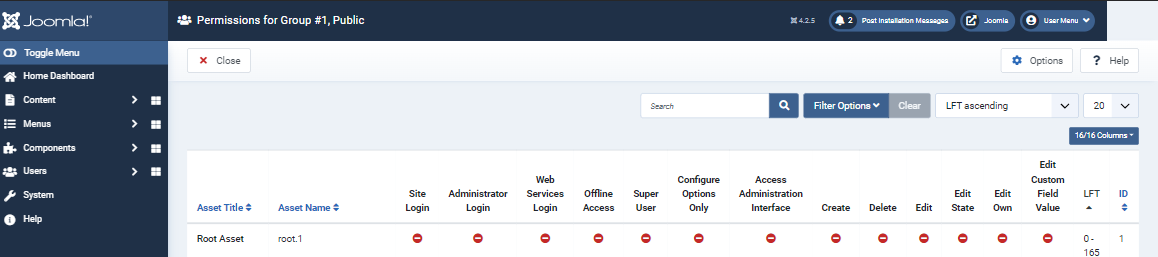
On screens above 1950 resolution the responsiveness is good but as you start going below that the UI start breaking.
On my screen (1500 resolution) it looks something like this
Permissions.for.Group.1.Public.-.Joomla.-.Administration.-.Brave.2022-11-30.11-08-21.mp4
After making changes it look like this

- Column selector is easily accessible.
- There is no horizontal scroll bar on table.
- There is no horizontal scroll bar on body.
Link to documentations
Please select:
-
Documentation link for docs.joomla.org:
-
No documentation changes for docs.joomla.org needed
-
Pull Request link for manual.joomla.org:
-
No documentation changes for manual.joomla.org needed

In addition you have tested on an older version of joomla without the table column selector


It also works fine on v.4.2.5

As already stated. This breaks at larger sizes

And at smaller sizes it is no better than before

 joomla-cms-bot
-
joomla-cms-bot
- | Category | ⇒ | Administration com_users JavaScript Repository NPM Change |
Fixed!! Now it looks like this

and at small sizes??
honestly this is one of those cant be fixed issues and why we introduced the table columns feature - my opinion only
Regarding smaller devices, It works fine till 1500 which is the resolution of most laptops. Below 1500 the horizontal scrollbar of the body appears but still, it will remove the horizontal scrollbar of the table. The column selector can still be there as if the user only wants to see selected columns. As a solution to below 1500, The sidebar closes at 1000 which can be closed at 1500.
That is why I said that this is not responsive as you stated in your description.
For me this just makes everything worse for everybody and is not an improvement to the current behaviour - my opinion only
| Status | New | ⇒ | Closed |
| Closed_Date | 0000-00-00 00:00:00 | ⇒ | 2022-11-29 14:52:10 |
| Closed_By | ⇒ | chmst | |
| Labels |
Added:
NPM Resource Changed
?
|
||

@Lakshay-Pruthi Thank you for making this PR! Unfortunately we cannot accept it, it does not resolve the problem, as @brianteeman said.
To be honest - if it would be possible to make this responsive, I had made it years ago, but did not find a solution.
@chmst
I know it does not completely resolve the problem but there is lot of improvement
Before
-
It starts breaking at 1950
-
it has a horizontal scrollbar both on table as well as on body

-
Experience on 1500 was worse

After
-
It works fine till 1500 which is much better than 1950

-
there is no horizontal scroll bar on table even below 1500

I think it will improve the user experience a lot.

Ah, I just saw it was reopened and then closed again.
If this PR is an improvement, it can always be reopened by the author. But then the title and description should be changed to reflect what the PR really does. Currently they don’t because the PR doesn’t make that view really responsive for mobile devices with small screens.
@richard67
The overflow is because of the padding given in the table cells which needs to be removed if you want to see all the columns properly on small devices.
Currently, the column selector is also not accessible properly
Permissions.for.Group.1.Public.-.Joomla.-.Administration.-.Brave.2022-11-30.11-08-21.mp4
After watching this video think this PR make sense or not.
If yes, should I open a new PR with correct title and description?
If yes, should I open a new PR with correct title and description?
@Lakshay-Pruthi No need to make a new one. If you go to your PR on GitHub you can edit the title, the description and you can reopen it, as far as I know. I am in the office today so I can’t check your video right now.
I couldn't find any option to reopen it. As far as I know, I don't have the right/access . Regarding title, I don't know how to explain the responsiveness without using the word responsiveness. May be @chmst and @brianteeman are misunderstanding the PR. This is my last explanation on this.
On screens above 1950 resolution the responsiveness is good but as you start going below that the UI start breaking.
On my screen (1500 resolution) it looks something like this
Permissions.for.Group.1.Public.-.Joomla.-.Administration.-.Brave.2022-11-30.11-08-21.mp4
After making changes it look like this
- Column selector is easily accessible.
- There is no horizontal scroll bar on table.
- There is no horizontal scroll bar on body.
The same explanation has been added in the description also.
Responsive web design is about creating web pages that look good on all devices!
A responsive web design will automatically adjust for different screen sizes and viewports.
Currently the table has so much information in it that it scrolls
The changes in this PR dont prevcent that. they just prevent the scroll at a slightly smaller resolution than currently at the expense of an uglier and harder to read dis0play
Thjis does not make it responsive. It just makes it fit in a slightly narrower screen.