[#33816] - [4.0] Remove extra column in com_banners client
- Closed
- 16 May 2021
- Medium
- Build: 4.0-dev
- # 33816
- Diff
- rjharishabh:banners-new_client
User tests: Successful: Unsuccessful:
Pull Request for Issue #33813.
Summary of Changes
remove row and column width to remove extra column
Testing Instructions
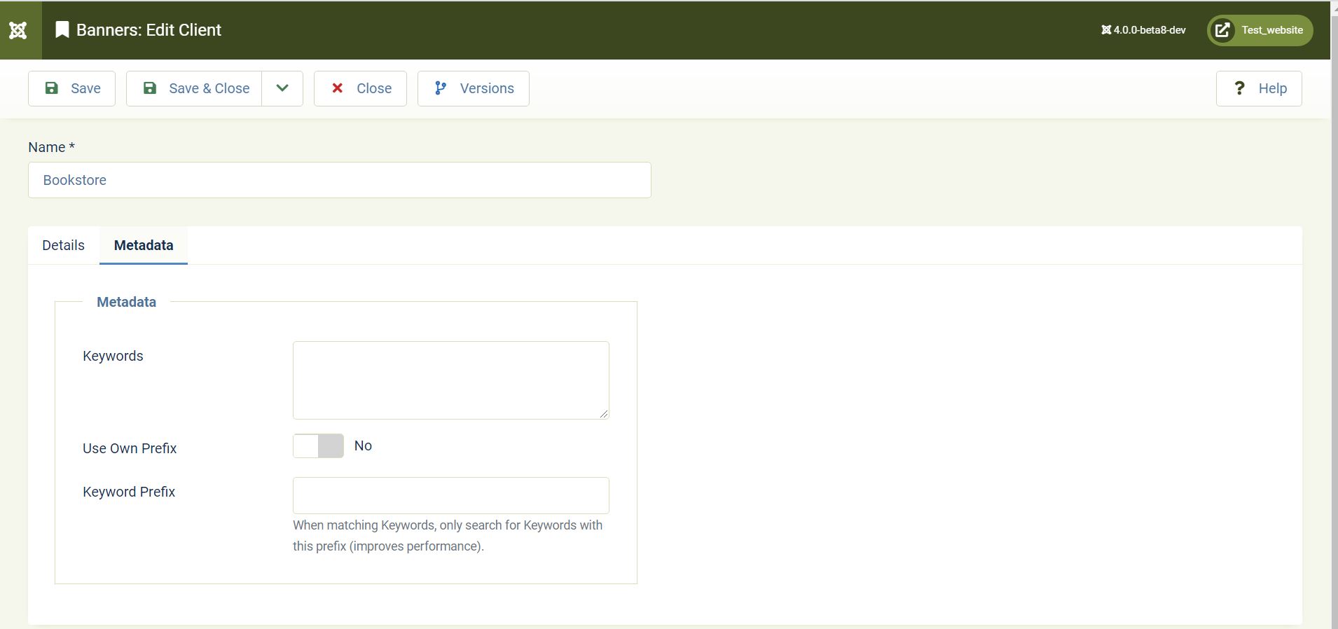
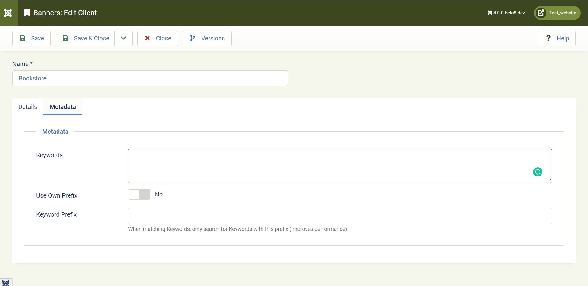
Dashboard > Components > Banners > Client > Edit any client or create using New > Go to Metadata tab
Apply PR
and see the difference
Actual result BEFORE applying this Pull Request
Expected result AFTER applying this Pull Request
Documentation Changes Required
No
| Status | New | ⇒ | Pending |
 joomla-cms-bot
-
joomla-cms-bot
- | Category | ⇒ | Administration com_banners |


I wonder if this change is desirable. Who is in charge of the (final) design of joomla?

Maybe there will be some reason to design like this.
Maybe there will be some reason to design like this.
I asked myself that question too.

Have you tested on small screen sizes/devices?
Have you tested on small screen sizes/devices?
Yes
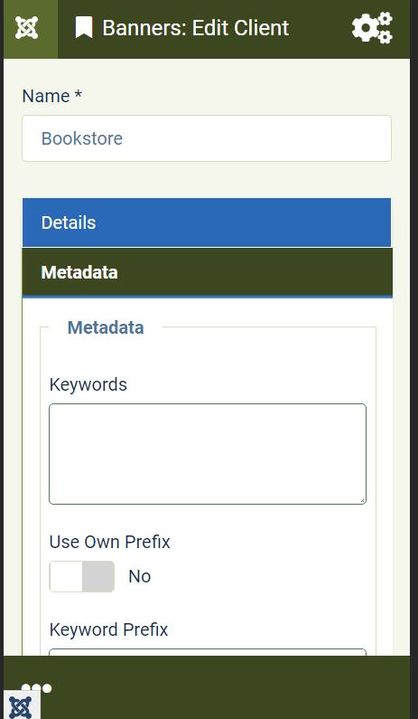

I have tested this item
Oh, I missed the point of testing. It works. Thank you.
This comment was created with the J!Tracker Application at issues.joomla.org/tracker/joomla-cms/33816.

Because whitespace doesnt need to be filled for the sake of it. Form fields shouldn't be nearly 100% of the viewport.
@brianteeman should I revert this or change the width.
PR for similar issue #33806

Because whitespace doesnt need to be filled for the sake of it. Form fields shouldn't be nearly 100% of the viewport.
@C-Lodder Thanks for explaining, and I think you are right.
But people opened issue about that and PR's were made and tested with success, so I have set the one or other RTC without having an own, deeper look into it, and without knowing if it was a design decision or not.
Am happy if you or @brianteeman can step in and point me (and maybe others, too) to the right direction.
Regarding the white space, maybe we should tell those who opened the issues how to make overrides which show nice cat pictures at that place (or puppies if they prefer that).
@richard67 You are very nice to your coworkers and NOT very nice (or NOT very witty) to other (less familiar) users. Stop this unless you intend to write your own documentation page for posting pictures of cats and dogs.
The request for the problem was submitted by analogy with the other, which was corrected and accepted.

Humour is often lost in translation
Sorry .. I did not want to offend anybody.
@richard67 Personally, I'd leave the current width as it is. Form field widths should be set to that of the expected content length, or ideally no longer than 80-100 characters per row.
I'm not a UX expert, but have done lots of research on this in the past, so hopefully it's applicable here.
@brianteeman @C-Lodder Do you think we should not only reject this PR here but also revert #33806 for being consistent again?

I see someone is against of a pictures of a cats.
About the issue. I agree with @C-Lodder.
To me it looks nicer when the fields is compact. They does not contain a lot of content, does not need to make them huge.
And 100% width on large screen looks bad.
I would not merge it.
UPD: the same about #33806
On large screen User is forced to move eyes from left edge to right edge.
This actually the same why newspaper does not print the text in 100% width, but split in to columns, this is more easy to eyes.
| Status | Pending | ⇒ | Closed |
| Closed_Date | 0000-00-00 00:00:00 | ⇒ | 2021-05-16 10:56:16 |
| Closed_By | ⇒ | rjharishabh | |
| Labels |
Added:
?
|
||
I have tested this item✅ successfully on 4f2c856
This comment was created with the J!Tracker Application at issues.joomla.org/tracker/joomla-cms/33816.