[#32974] - [4] initial concept of table options
- Closed
- 2 May 2021
- Medium
- Build: 4.0-dev
- # 32974
- Diff
- PhilETaylor:tableoptions
User tests: Successful: Unsuccessful:
Summary of Changes
THIS. IS. ALMOST. INCOMPLETE.
This is my worse work to date, Im totally at the limit of JS here.. but "it works on my machine", it "looks ugly and needs css"
Happy to merge any PRs made to the branch - this needs some help to get it over the line!
A huge thanks to @dgrammatiko so far. He gave me clean code and I butchered it.
Testing Instructions
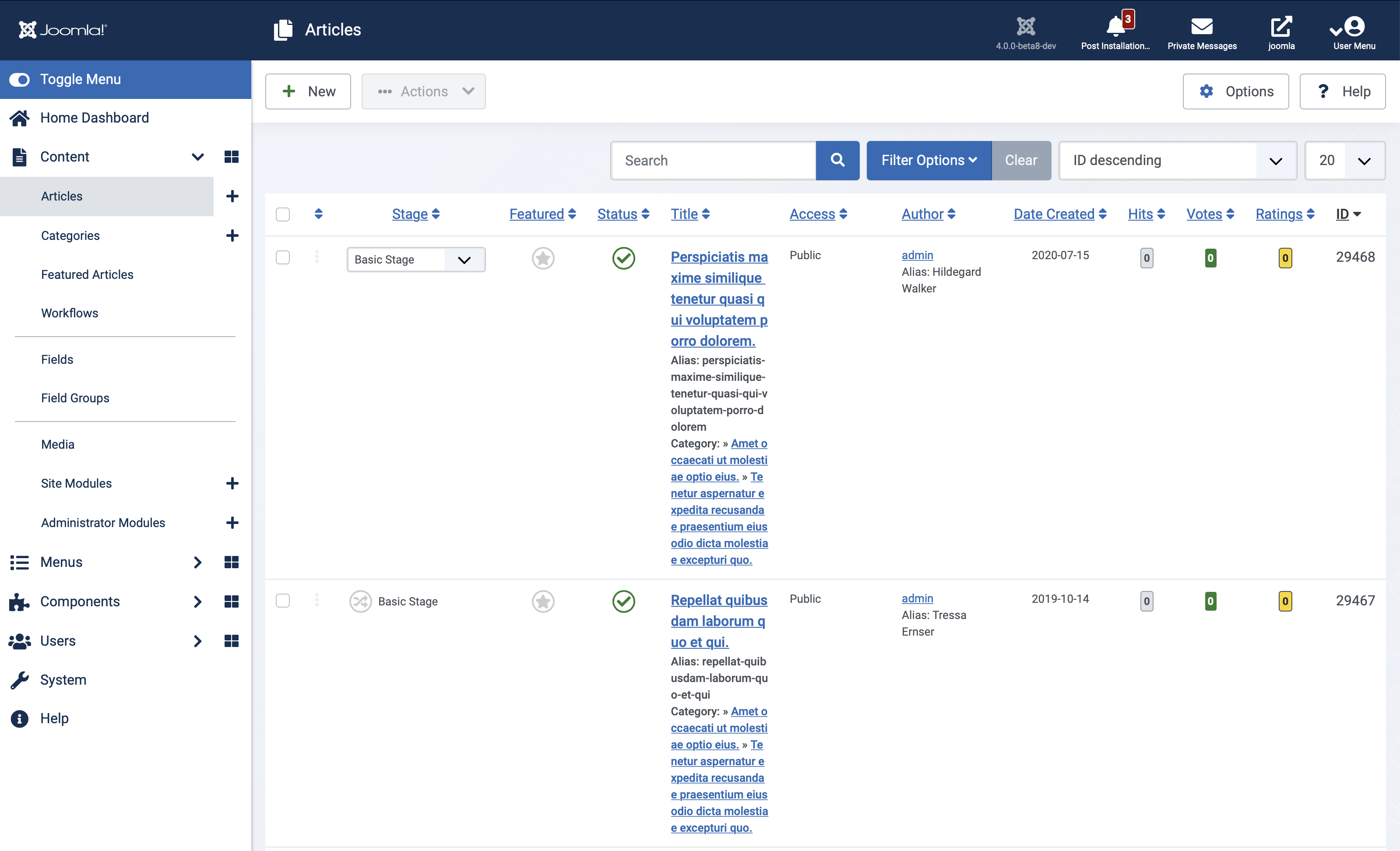
I have only applied the change to the Users, Articles and Categories pages.
Actual result BEFORE applying this Pull Request
No way to hide columns
Expected result AFTER applying this Pull Request
A new Table options list at the foot of a table, that allows you to deselect columns to HIDE and to select columns to SHOW
Your preferences are STORED in your browser localstorage for that site. When you reload the page or return to the same page, your preferences are reapplied.
LIMITATIONS & NOTES:
The first 2 columns can never be hidden, these are normally the checkbox and the dragger (or the checkbox and the username on the users list)
Occasionally Ive seen a CSS issue on the new checkbox list layout, but Ive applied no css at all so far.
ONLY tested in Safari and Firefox but SHOULD work in all browsers
ONLY shows up in 1024px wide screens and above by design.
The bottom of the table was chosen for the placement of the Table Options as the page has been "designed" previously and adding them at the top just gets in the way.
Probably have to target 4.1-dev as this is a new feature.
Future improvement ideas already suggested:
- Store the preferences against the user object in the db for browser/computer independentcy
- Initially hide most things to "clean up" the user interface and allow users to add more clutter
- Overcome the bootstrap limitation of classes for screens less tan 1024px wide and remove all responsive classes that are currently hiding things, and allow all columns on mobile devices to be toggled with table options.
Preview:

Documentation Changes Required
Yes.
| Status | New | ⇒ | Pending |
 joomla-cms-bot
-
joomla-cms-bot
- | Category | ⇒ | Administration com_categories com_content com_users JavaScript Repository NPM Change |

ONLY shows up in 1024px wide screens and above by design.
Why add this limitation?

Well the other option was to store your preferences in the database against your user object... not hard to do, but... I have all weekend ...

For me the main problem with this approach is that its per computer, per browser, per site,
We could add a PHP ajax endpoint to store the state on the user's account options, that's easily doable
ONLY shows up in 1024px wide screens and above by design.
Why add this limitation?
Because when you view your site on a mobile, the responsive design of the admin template kicks in and most columns are already hidden. the 1024 was the number @dgrammatiko pulled out of the hat.
The first 2 columns can never be hidden,
If you hide the cell that contains the scope then you break the tables accessibility. This is usually (always?) the cell that is the link.
I guess it would be daft for a user to hide that but we all know users can be daft so perhaps prevent this column from being hidden as well.
ONLY shows up in 1024px wide screens and above by design.
Why add this limitation?Because when you view your site on a mobile, the responsive design of the admin template kicks in and most columns are already hidden. the 1024 was the number @dgrammatiko pulled out of the hat.
But what if I wanted to decide the columns for myself. That wasn't possible before but it would be now
But what if I wanted to decide the columns for myself. That wasn't possible before but it would be now
Then someone would have to go through each screen removing the responsive classes that hide things
Why add this limitation?
The limitation comes from Bootstrap's utilities and the forced !important everywhere. Removing this means we need an array with all the possible classes that need to be removed... It needs a bit of thinking here
If you hide the cell that contains the scope then you break the tables accessibility. This is usually (always?) the cell that is the link.
Not always easy to know WHICH link in WHICH column... as there are lots of links in the row... links to toggle state, featured etc...
We could go through and throw a class on THE MAIN COLUMN to target I guess...
Its only breaking accessibility if you choose to hide that column and no one would right... ? well never say never :)
The first 2 columns can never be hidden
@PhilETaylor I would keep also the ID always visible (eg arr.length - 1) but that's just personal opinion here
but that's just personal opinion here
Which is why its configurable now - you are now free to keep it and Im free to hide it ;-)
Not always easy to know WHICH link in WHICH column... as there are lots of links in the row... links to toggle state, featured etc...
actually it can be determined programmatically because it is a th not a td and has a scope="row"
@dgrammatiko @PhilETaylor ok I understand the 1024 part now
actually it can be determined programmatically because it is a th not a td and has a scope="row"
AWESOME.
| Labels |
Added:
NPM Resource Changed
?
|
||
@PhilETaylor can you diff your script with https://gist.github.com/dgrammatiko/4d8121c2cda4096224d4de283a1a433a you need a couple of conditonals for sanity checks
Sure, multi tasking with real life parenting over the weekend so will be delayed sorry.
Todays improvements
- Now works well on Users, Categories and Articles pages
- Now correctly handles the non-text headers on the categories page, by using the text in the
visually-hiddenspan as text for the checkboxes - Now doesn't allow the hiding of the "main thing"
- Now allows the id/checkbox/ordering columns to be hidden (useful for screenshots and the like, give the user the power to make their own decisions)
- Some sense checks when the page loads to ensure the table contains enough of what we need to provide the options

I must be doing something wring. I applied the patch with Patchtester, ran npm ci, but did not see the dropdown list of columns to select for hiding. I did try the demo by @dgrammatiko.
Quite separately, I put the table in a div styled overflow-x: scroll; max-width: 1000px; right now I don't know how to get the width of the parent div. I quite like the left-right scroll that leaves the left menu, toolbar and search bar alone while the table scrolls. Please try it. It could be combined with any other column manipulation.
This comment was created with the J!Tracker Application at issues.joomla.org/tracker/joomla-cms/32974.

I must be doing something wring. I applied the patch with Patchtester, ran npm ci, but did not see the dropdown list of columns to select for hiding. I did try the demo by @dgrammatiko.
I had the same issue. The Patchtester doesn't do the "build" of the JS file of this feature. to Still try it out you could copy the js file contents form the PR to the folder "/media/system/js" and name the file tableoptions.js
At the moment it gave me a JS error on line 124 so i commented both 124 and 125 out so i could see it in action. it looks very promising and i think a very much needed feature to have a "workable" backend.
Here is an experiment to try:
Edit your locally installed administrator/components/com_content/articles/tmpl/default.php
Add these two lines to wrap the table:
					<div class="myscroller">
					... table here
					</div>
And then this after line 95:
$wa->addInlineStyle("
.myscroller {
	max-width: calc(100vw - 20rem);
	overflow-y: scroll;
}
.myscroller.wider {
	max-width: calc(100vw - 5rem);
}
");

$wa->addInlineScript("
	const vw = Math.max(document.documentElement.clientWidth || 0, window.innerWidth || 0);
	const test = document.getElementsByClassName('myscroller');

	var ro = new ResizeObserver(entries => {
		for (let entry of entries) {
			const cr = entry.contentRect;
			if (cr.width < 100) {
				test[0].classList.add('wider'); // = vw - cr.width + \"px\";
			} else {
				test[0].classList.remove('wider'); // = vw - cr.width + \"px\";
			}
		}
	});

	ro.observe(document.getElementById('sidebar-wrapper'));
", [], ['type' => 'module']);
Click on the table to scroll left-right. Make the screen narrower - try simulating an iPad in landscape and portrait mode. And toggle the side menu.
@ceford this PR relates to a Javascript feature to hide/show columns. If you would like to propose a competing/complimenting solution with horizontal scrolling of tables then please make a new PR.
Horizontal scrolling on MOBILE devices is a nice feature when correctly implemented. However, as I have shown time and time again, the root issue Im trying to resolve is NOT ON MOBILE DEVICES, but on my HUGE 27" iMac screen, when a Joomla page on half the screen, still has the items squashed into a stupid amount of column space - my screenshot examples of this are here #31915
Horizontal scrollable tables are not going to help me on a 27" iMac Desktop. This would make Joomla Admin on desktop work like Excel... which would be a huge step back.
@ceford this PR relates to a Javascript feature to hide/show columns. If you would like to propose a competing/complimenting solution with horizontal scrolling of tables then please make a new PR.
Sorry, getting this issue mixed up with #31915. Just thinking of the general problem with wide tables.
The problem is not that the table is "wide" the problem is that even in a wide table, the columns are very very narrow as Joomla is trying to put so much into its table grids - most of which no body needs, until they need to sort on that column.
Having the main title of an article squashed so that you can show the votes (which is disabled by default) and hitscolumn is bad UI IMHO.
This is out of the box with workflow enabled on half a 27inch screen!:
| Status | Pending | ⇒ | Closed |
| Closed_Date | 0000-00-00 00:00:00 | ⇒ | 2021-05-02 15:27:33 |
| Closed_By | ⇒ | PhilETaylor |
@PhilETaylor may I ask why you've killed this one?
Only so much negativity one person can cope with. I'll be completing my work on Empty States, and now that my work on the FTP Layer is not needed, I'll be spending May trying to cream as much money from consultancy as possible instead of contributing for free...
Im not sure, in its current state, that this had much chance of being merged anyway.
I think the only bits still needed on this are (from memory) for the next person picking this up:
- CSS
- Posting the preferences back via AJAX to store them in the Users State (or Users Params to persist across sessions), storing against the url/view/component used on.
- Reflecting the current preferences when a page loads to hide/show the right columns again
- Maintainers buy in - no Maintainer has actually agreed this is a feature they want to add
- As its a new feature, it can no longer be added to Joomla 4.0 and needs to be based on 4.1 (aka some years away probably)
- Could/Should be implemented as a Joomla Plugin, so can be enabled/disabled at will.
- Initially hide most things to "clean up" the user interface and allow users to add more clutter
- Disabling completely (or testing perfectly) on mobile devices.
Nice work. For me the main problem with this approach is that its per computer, per browser, per site,
But maybe thats just me