[#31037] - [4.0 dev] Correct the layout of the modals in "Manage Folders" and "New File" in Template manager.
- Fixed in Code Base
- 19 Oct 2020
- Medium
- Build: 4.0-dev
- # 31037
- Diff
- particthistle:4.0-dev
User tests: Successful: Unsuccessful:
Pull Request for Issue #31033 and #30954.
Summary of Changes
Modified the modal settings for both the "Manage Folders" And "New File" modal windows that appear when you edit a template.
- Modal size changed from 50vh and 60vw to 70vh and 80vw
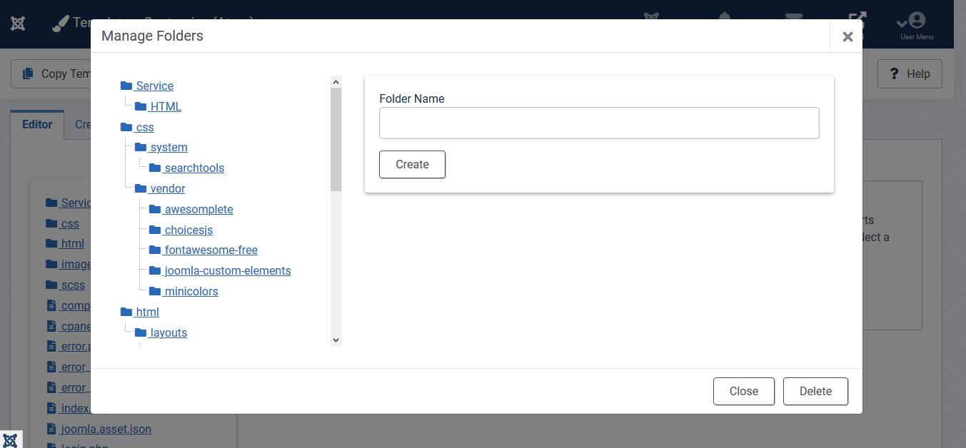
- Layout of modal columns changed from col-md-6 & col-md-6 to col-md-4 and col-md-8 to closer match Templates: Customisation screen ratios (it uses 3/9)
- Class for .modal-body .tree-holder - sets a max-height for the tree-holder in the modal view. The .tree-holder class is also applied in the customisation screen view, and doesn't need to have it's height restricted there.
- Several responsive styles have been added to reformat the modal contents on max-width:768px
Testing Instructions
- Familiarise yourself with the BEFORE status.
- Apply the patch. Note that you can manually add the new class to \media\com_templates\css\admin-templates-default.css rather than needing to install the patch using NPM as the CSS file is precompiled.
- Go to: System > Site Templates > Edit the template by clicking on "Cassiopeia Details and Files"
- Click on the "New File" and "Manage Folders" buttons.
- Check what the layout of the modal looks like.
- Go to: System > Adminstrator Templates > Edit the template by clicking on "Atum Details and Files"
- Click on the "New File" and "Manage Folders" buttons.
- Check what the layout of the modal looks like.
Actual result BEFORE applying this Pull Request
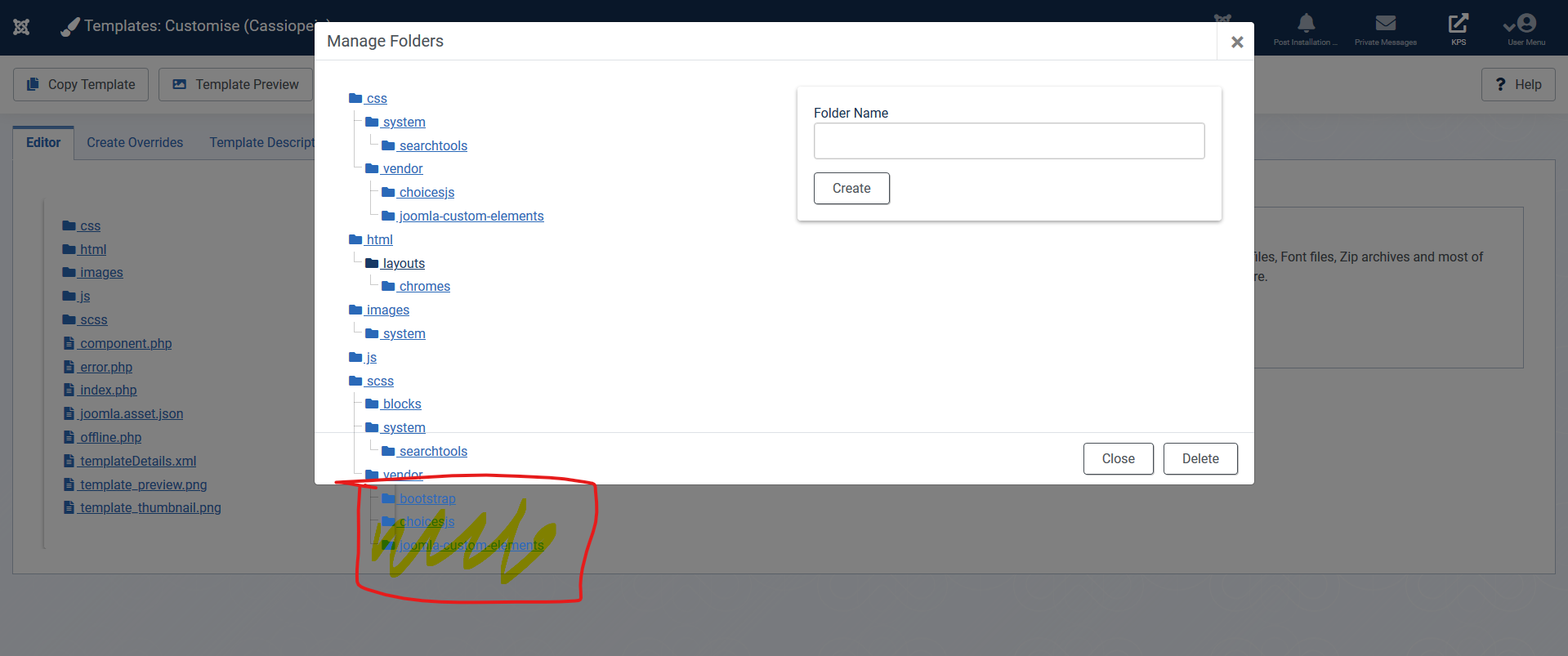
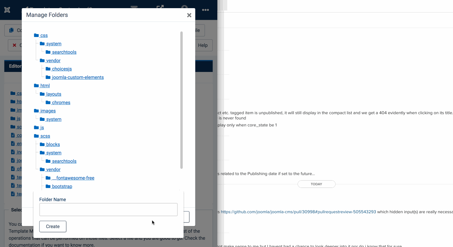
Per the various screen grabs in #31033, you before applying the PR you will have issues on screens under 1400px with the layout being cramped, and on all screens the folder tree when displayed in the modal, the tree extends over the bottom of the modal, meaning the close and/or delete buttons (depending on the screen) are disabled due to the z-index of the folder tree.
Expected result AFTER applying this Pull Request
Note that the CSS change is required to make the folder tree height correct.
-
Layout will change so the columns are 4:8 ratio.
-
With the folder tree height capped proportional to the new height of the modal, the buttons now work.
-
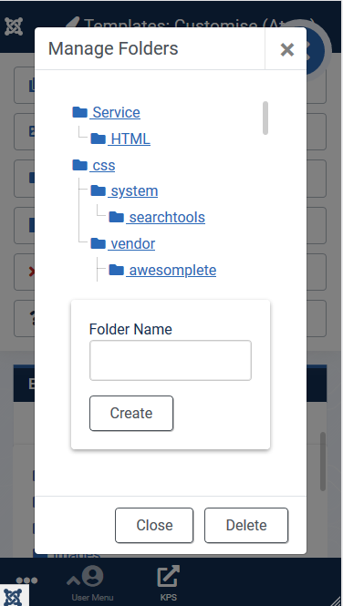
Check also responsive layout on max-width:768px and below.
-
Uncommon as it would be for someone to modify the template via mobile, the layout now at least provides the ability to do so if needed.

Documentation Changes Required
No documentation changes are needed.


| Status | New | ⇒ | Pending |
 joomla-cms-bot
-
joomla-cms-bot
- | Category | ⇒ | Administration com_templates Repository NPM Change |

| Labels |
Added:
NPM Resource Changed
?
|
||
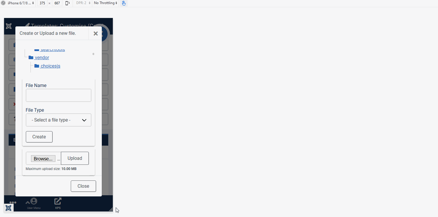
CSS for mobile partially fixed. New styling fixes the Manage Folders view (see screenshot) but not the new file view, as that requires two options: either create the new file, or upload a file (though hard to do from a phone). Look forward to hearing thoughts.
| Title |
|
||||||

Almost there.
Problems with max-height in
@media (min-width: 768px) {
	.modal-body .tree-holder {
		max-height: 30vh;  // Here, I had to comment it.
		margin-bottom: 20px;
	}
}
Macintosh Firefox, Safari
@media (max-width: 768px) {
	.modal-title { /* Reduces the modal title to stop it wrapping */
		font-size: 1rem;
	}
	.modal-body .tree-holder { /* Shrinks area for the tree in mobile modal view */
		max-height: 12vh;
		margin-bottom: 20px;
	}
	.modal-body .card-body { /* Padding in the card boxes where the filename or folder name is created */
		padding: .75rem;
	}
	.modal-body .col-md-4, .modal-body .col-md-8 { /* Fills the modal wider when the columns stack. */
		padding-left: 0;
		padding-right: 0;
	}
	.card-body .mt-2 { /* Reduces the size of the "Maximum Upload size note" */
		font-size: 12px;
	}
}
Responsive styling improved. I've put in changes specific to these modals, rather than applying it to overall responsive classes in the template, though some of that might need to be considered globally in the template main template.css file.
CSS Comments above are not included in the admin-templates-default.css.

I have tested this item
I still have the problem with the overlapping formfields (see comments)
This comment was created with the J!Tracker Application at issues.joomla.org/tracker/joomla-cms/31037.
I have tested this item
I still have the problem with the overlapping formfields (see comments)
This comment was created with the J!Tracker Application at issues.joomla.org/tracker/joomla-cms/31037.
I have tested this item
tested again and now it works. I had some trouble with the cache (deleting the browser cache did not solve the problem).
This comment was created with the J!Tracker Application at issues.joomla.org/tracker/joomla-cms/31037.

I have tested this item
| Status | Pending | ⇒ | Ready to Commit |

RTC
This comment was created with the J!Tracker Application at issues.joomla.org/tracker/joomla-cms/31037.
| Status | Ready to Commit | ⇒ | Fixed in Code Base |
| Closed_Date | 0000-00-00 00:00:00 | ⇒ | 2020-10-19 06:16:54 |
| Closed_By | ⇒ | HLeithner | |
| Labels |
Added:
?
|
||

Thanks
Further changes are required in admin-templates-default.css to add responsive css to the modal as there's additional layout problems with the modal on smaller screens. That CSS file currently has no breakpoints.
Inspecting the code, I need to add a breakpoint for: breakpoint-md: 768px;