Feeling Lucky
?
[#28085] - [4.0] Display version number
- Closed
- 24 Dec 2020
- Low
- Build: 4.0-dev
- # 28085
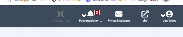
As seen in the image we display another joomla logo and the version number in the toolbar. To avoid confusion with the other items there which are buttons it was styled differently.
With the new revision of the template it fails accessibility tests for color contrast. Even without the tests it is clear that it needs to be changed.
But do we really need to display the version number on every single page of the site?
Would it perhaps be better as a footer to the sidebar?
| Labels |
Added:
?
|
||
| Priority | Medium | ⇒ | Low |
| Build | staging | ⇒ | 4.0-dev |
| Category | ⇒ | Administration Layout |

| Status | New | ⇒ | Duplicate Report |
| Closed_Date | 0000-00-00 00:00:00 | ⇒ | 2020-04-15 15:00:57 |
| Closed_By | ⇒ | jwaisner |
| Status | Duplicate Report | ⇒ | Closed |
| Closed_By | jwaisner | ⇒ | joomla-cms-bot |

joomla-cms-bot
- comment
- 15 Apr 2020
Set to "closed" on behalf of @jwaisner by The JTracker Application at issues.joomla.org/joomla-cms/28085

jwaisner
- comment
- 15 Apr 2020
Closing as duplicate. Please see #26734
This comment was created with the J!Tracker Application at issues.joomla.org/tracker/joomla-cms/28085.
| Status | Closed | ⇒ | New |
| Closed_Date | 2020-04-15 15:00:57 | ⇒ | |
| Closed_By | joomla-cms-bot | ⇒ |
| Status | New | ⇒ | Discussion |
| Status | Discussion | ⇒ | Closed |
| Closed_Date | 0000-00-00 00:00:00 | ⇒ | 2020-12-24 12:39:49 |
| Closed_By | ⇒ | brianteeman |

brianteeman
- comment
- 24 Dec 2020
Closed as this has now been fixed
Previous discussion #26447.