Feeling Lucky
No Code Attached Yet
[#38419] - [4.1.5] UX: Multilingual Associations: 'Status' Icons different to other components
- Closed
- 8 Aug 2022
- Medium
- Build: 4.2-dev
- # 38419
What needs to be fixed
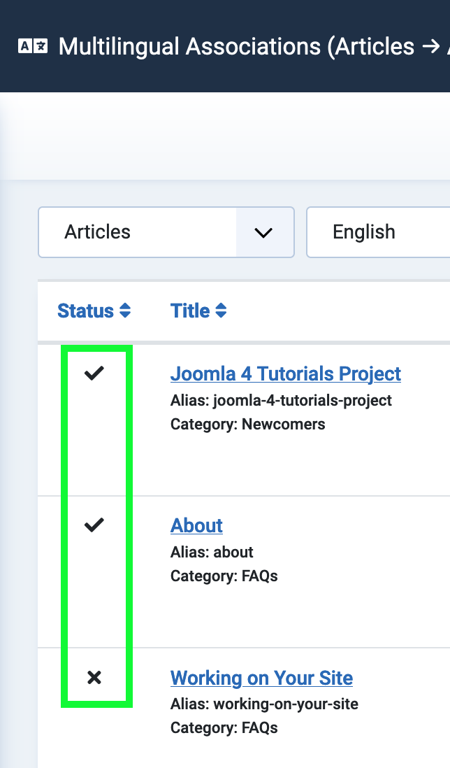
In Multilingual Associations the icons of 'Status' are different to other components:
| Multilingual Associations | Example 'Contacts' |
|---|---|
 |
 |
Why this should be fixed
Better UX if using the same icons.
How would you fix it
?
Side Effects expected
?
 joomla-cms-bot
-
joomla-cms-bot
- | Labels |
Added:
No Code Attached Yet
|
||
| Status | New | ⇒ | Closed |
| Closed_Date | 0000-00-00 00:00:00 | ⇒ | 2022-08-08 11:22:23 |
| Closed_By | ⇒ | richard67 |


Franzwohlkoenig
- comment
- 8 Aug 2022
I hope you agree with me that for this reason they definitely should look different.
I do, thanks @richard67, haven't thougt about 'toggled'.
The difference is: In the other components, the status can be changed by clicking the icon, and there is a tool tip telling that, so it is not just a display but a toggle.
In the multilingual status view, the icon cannot be clicked, it is just a status display.
I hope you agree with me that for this reason they definitely should look different.
And if you check the multilingual status module where the status is also shown with check marks but cannot be toggled, they are also shown without a circle, so that is consistent, too.
Closing as expected behaviour.