[#34780] - Fix Cassiopeia mobile breakpoint too small
- Fixed in Code Base
- 27 Aug 2021
- Medium
- Build: 4.0-dev
- # 34780
- Diff
- RickR2H:mobile-breakpoints
User tests: Successful: Unsuccessful:
Pull Request for Issue # .
Summary of Changes
The Cassiopeia template used mobile breakpoint that are to small. With this PR the breakpoint to switch to mobile is shifted from 768px to 992px. My initial PR #34687 to make it breakpoints fully configurable got rejected and I hope this PR is a solution to fix the majority of mobile issues.

The fact that the mobile breakpoint is to small is probably introduced to the switch from Bootstrap 4 to Bootstrap 5 which introduces a sifting in breakpoints.
Testing Instructions
Install the PR and rebuild the CSS. Best to use the demo data to check all other elements too. See if the template behaves like expected.
Actual result BEFORE applying this Pull Request
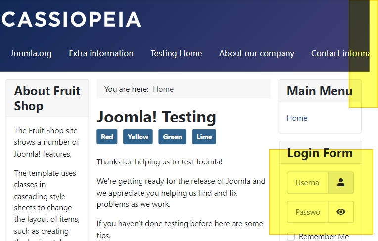
Mobile breakpoint to small
Expected result AFTER applying this Pull Request
Mobile breakpoint a bit bigger
Documentation Changes Required
No
| Status | New | ⇒ | Pending |
 joomla-cms-bot
-
joomla-cms-bot
- | Category | ⇒ | Administration Templates (admin) NPM Change Front End Templates (site) |


There was no shifting in breakpoints. They just added a new breakpoint, the other ones behave exactly as they did.
https://getbootstrap.com/docs/5.0/migration/#grid-updatesOn my device xs is vertical mobile, sm is horizontal mobile. md is never hit.
Never mind the breakpoints comment.
On mobile the breakpoints will never be met because the screen is always to small
@barsdeveloper to clarify a bit more:
@bembelimen is this PR a better solution?

Yes, something like that should be the way forward, thx.

Looks good for me. Tesing in firefox,win 10.
Would be nice to get tests from different browsers and screen widths.
This comment was created with the J!Tracker Application at issues.joomla.org/tracker/joomla-cms/34780.

| Labels |
Added:
Conflicting Files
NPM Resource Changed
?
|
||
@brianteeman @chmst Conflicts are fixed
 Quy
-
Quy
- | Title |
|
||||||
| Labels |
Removed:
Conflicting Files
|
||

I have tested this item
This comment was created with the J!Tracker Application at issues.joomla.org/tracker/joomla-cms/34780.

I have tested this item
This comment was created with the J!Tracker Application at issues.joomla.org/tracker/joomla-cms/34780.
| Status | Pending | ⇒ | Ready to Commit |

RTC
This comment was created with the J!Tracker Application at issues.joomla.org/tracker/joomla-cms/34780.
| Labels |
Added:
?
?
Removed: ? |
||
| Category | Administration Templates (admin) NPM Change Front End Templates (site) | ⇒ | Front End Templates (site) NPM Change |
@drmenzelit That wasn't my intention. Reverted to SCSS of the Atum template.
| Status | Ready to Commit | ⇒ | Fixed in Code Base |
| Closed_Date | 0000-00-00 00:00:00 | ⇒ | 2021-08-27 11:00:06 |
| Closed_By | ⇒ | bembelimen | |
| Labels |
Added:
?
Removed: ? |
||
Thx

Is there a way to make the hamburger menu to appear from 992px using css override on user. css? I manage to do so only by changing original template css from @media 768 to @ media 992?
This comment was created with the J!Tracker Application at issues.joomla.org/tracker/joomla-cms/34780.

Is there a way to make the hamburger menu to appear from 992px using css override on user. css? I manage to do so only by changing original template css from @media 768 to @ media 992?
This comment was created with the J!Tracker Application at issues.joomla.org/tracker/joomla-cms/34780.
You can create an override of the menu and change the class controlling the breakpoint. Have a look at Bootstrap.
Thanks for your help. So this way I can create the code to include in my user.css or the procedure is deferent? I am new with bootstrap...
This comment was created with the J!Tracker Application at issues.joomla.org/tracker/joomla-cms/34780.
Please use this stream only if you have comment regarding the pull request!
As addition to the previous comment, search ik Google for "How to create a Joomla override" This will het jou started. If you really need help, then it's better to ask for help via the Joomla forums.
There was no shifting in breakpoints. They just added a new breakpoint, the other ones behave exactly as they did.
https://getbootstrap.com/docs/5.0/migration/#grid-updates
On my device xs is vertical mobile, sm is horizontal mobile. md is never hit.