[#34378] - [4.0] Front - Make the category articles list table responsive
- Closed
- 6 Jun 2021
- Medium
- Build: 4.0-dev
- # 34378
- Diff
- shim-sao:4.0-dev
User tests: Successful: Unsuccessful:

Pull Request for Issue # .
Summary of Changes
Make the category articles list table responsive on the frontend if the table width is larger than the client width like mobiles.
Testing Instructions
Display a category with a table of articles list and multiples columns (dates, hits...) to have a large table.
Actual result BEFORE applying this Pull Request
If the table is larger than the client, the table exceeds in width and the entire template is scrollable.
Expected result AFTER applying this Pull Request
The table overflow if hidden and only the table is scrollable
Documentation Changes Required
| Status | New | ⇒ | Pending |
 joomla-cms-bot
-
joomla-cms-bot
- | Category | ⇒ | Front End com_content |


I have tested this item
I have tested this item successfully.
Joomla versión: 4.0.0-rc1
PHP 7.4.13
Thank's!!
This comment was created with the J!Tracker Application at issues.joomla.org/tracker/joomla-cms/34378.

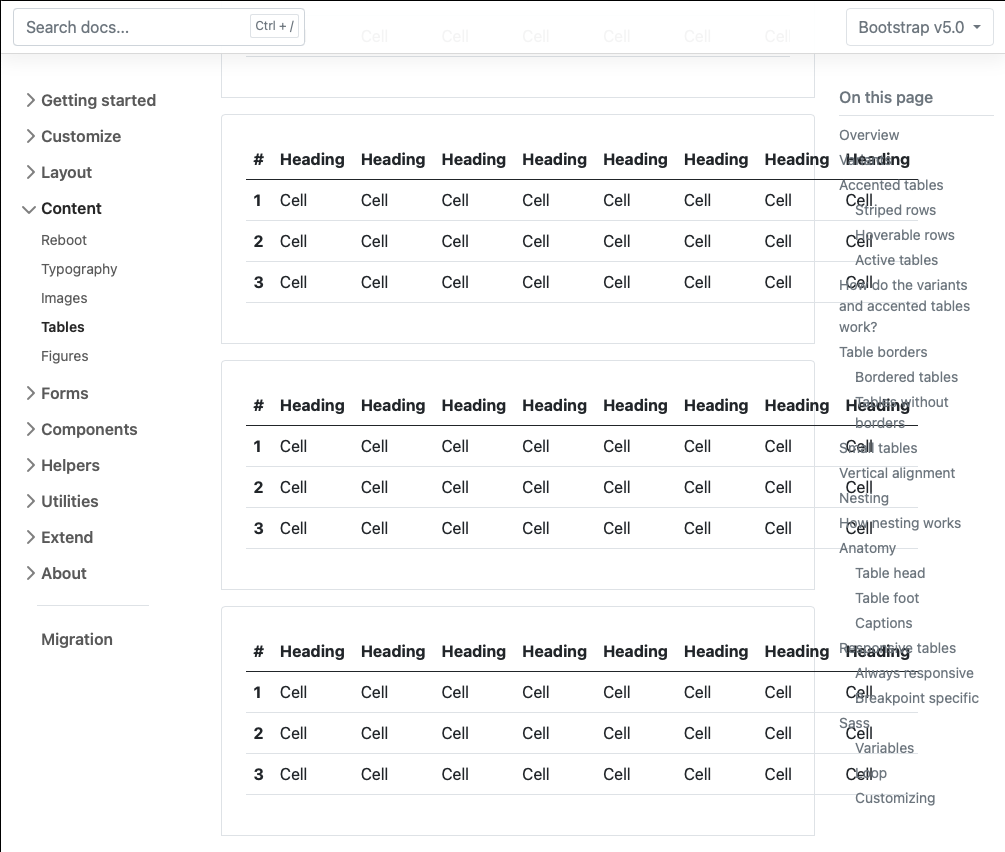
If you want to make the tables responsive you should use: https://getbootstrap.com/docs/5.0/content/tables/#responsive-tables

@bembelimen yeah, strongly recommended and also badly broken
It's "broken by design", because they use the "wrong" breakpoints (for the demo). So in general it should work with table-responsive or the correct break point suffix.
I will definitely embrace the term broken by design™©®. Describes perfectly my code
| Status | Pending | ⇒ | Closed |
| Closed_Date | 0000-00-00 00:00:00 | ⇒ | 2021-06-06 21:14:32 |
| Closed_By | ⇒ | shim-sao | |
| Labels |
Added:
?
?
|
||
I have tested this item✅ successfully on 62fd856
After following the Testing Instructions, the result is as expected.
This comment was created with the J!Tracker Application at issues.joomla.org/tracker/joomla-cms/34378.