Feeling Lucky
?
[#34322] - [4] alert warning yellow gulp
- Closed
- 1 Jun 2021
- Medium
- Build: staging
- # 34322
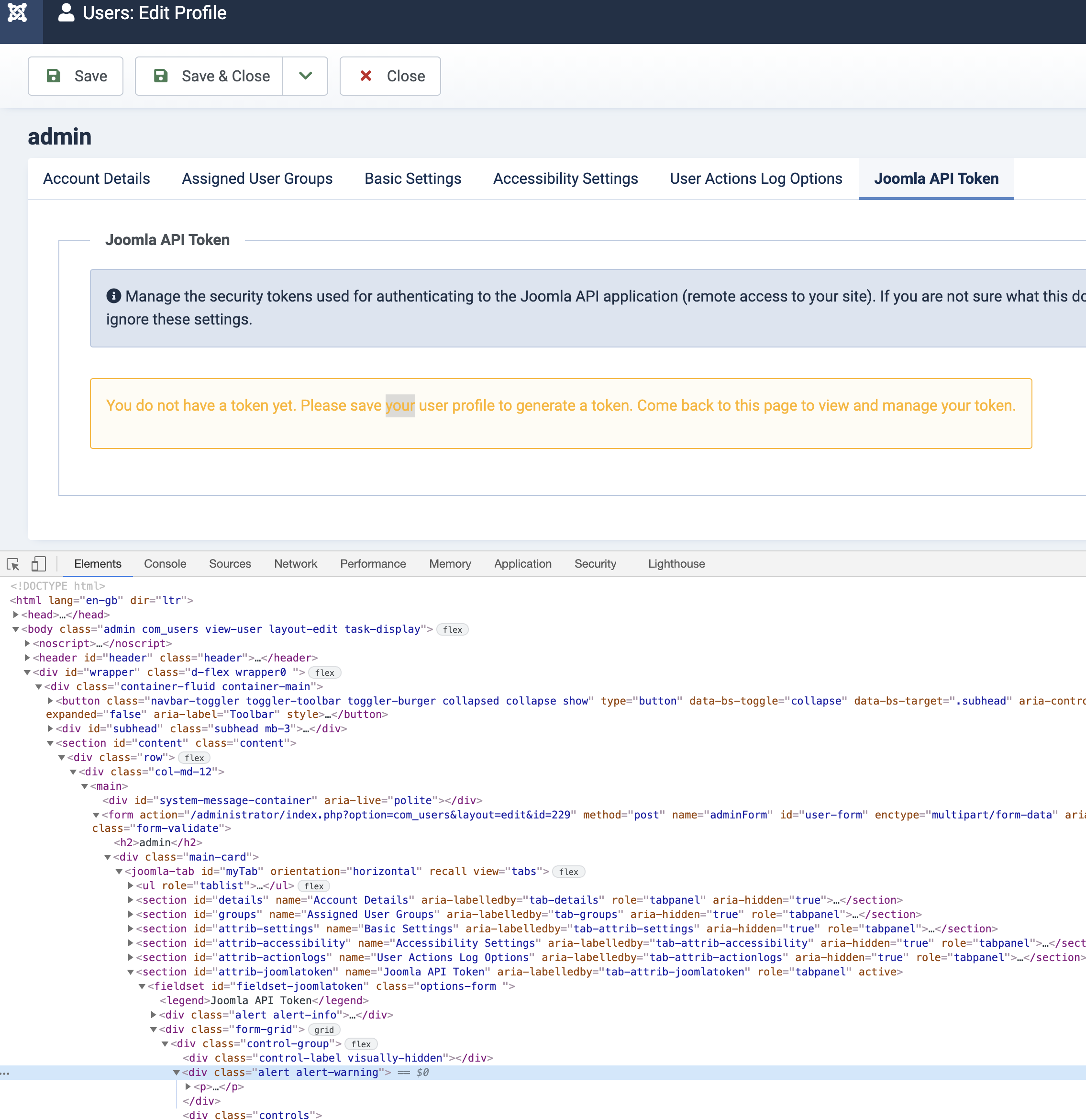
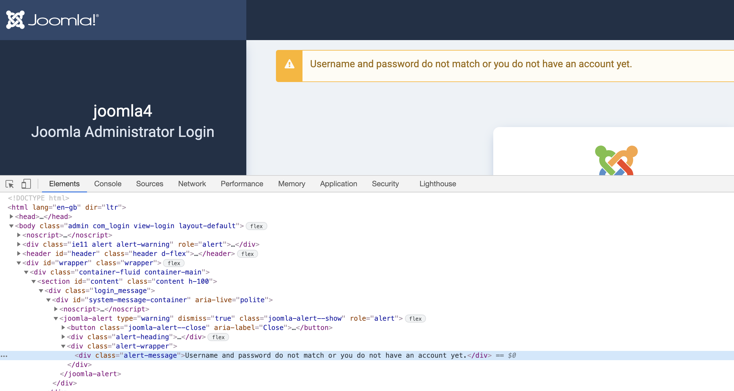
Something changed recently to the colours of the yellow in the alert warning which makes it very very hard on the eyes.
Furthermore it was only implemented to one type of warning and not the other. See the difference between a div with alert alert-warning and a joomla-alert custom element
If we are keeping this glaring in-your-face-and-painful-for-my-eyes yellow alert then it should be implemented consistently.
 joomla-cms-bot
-
joomla-cms-bot
- | Labels |
Added:
?
|
||

PhilETaylor
- comment
- 31 May 2021
Needs to be #976c0c to be AA with a ratio of 4.5 or for AAA 7.0 it needs to be a text color of #715109

| Status | New | ⇒ | Closed |
| Closed_Date | 0000-00-00 00:00:00 | ⇒ | 2021-06-01 10:19:32 |
| Closed_By | ⇒ | PhilETaylor |
The accessibility contrast is 1.72 which fails.