[#33463] - [4.0] Frontend: Colour theme "Alternative" show red save- and cancel-button
- Closed
- 2 May 2021
- Medium
- Build: staging
- # 33463
What needs to be fixed
As title say:
| Standard | Alternative |
|---|---|
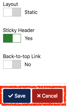 |
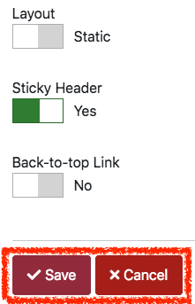 |
Why this should be fixed
Different Colours for different actions.
How would you fix it
Another colour for the Cancel-button.
Side Effects expected
Don't know.
 joomla-cms-bot
-
joomla-cms-bot
- | Labels |
Added:
?
|
||


@Shubham-com Set Colour theme "Alternative" in the template style and open for example the template style in the frontend. You can also open a module or article in frontend.

@sandramay0905 It's not perfect red as in Cancel.
It's an Alternate theme color

I don't find any problems like all the blue coloured stuff turn into lighter red including header and all. Since cancel and save are two different shades of red, I think its more or less fine

The alternative colour layout for Cassiopeia was only an example on how to do that. If someone has a better idea for a colour schema, please create a PR.
The "save" button has the class btn-primary so it will take the colour that is defined as primary in the template.
| Status | New | ⇒ | Closed |
| Closed_Date | 0000-00-00 00:00:00 | ⇒ | 2021-05-02 20:24:09 |
| Closed_By | ⇒ | richard67 |

Closing as intended behaviour due to the previous comments.
I thought its an UX- and a11y-issue cause the contrast in colour between the buttons is much lower than in the standard-theme.
Sorry to waste your time cause you are the experts, i'm only a user ;-)
@sandramay0905 In general you are right, it's just the alternative colour scheme being more a kind of example and not really ready to use.

and not really ready to use.
It should be
more a kind of example and not really ready to use.
Thanks for the info, @richard67 I don't wanna hurt someone who have build these alternative colour scheme and invest much time. It's not really ready to use – would this be communicated? If not i fear people will judge Joomla! once again.
Maybe better to not delivere the alternative scheme? Or rename it like "experimental"? Or deliver it with 4.1 and in a ready-to-use-status?
@sandramay0905 Please provide steps to reproduce this issue. Where you got this layout.