[#33049] - [J4] Radio Buttons: Visually not clear which is selected
- Closed
- 10 Apr 2021
- Medium
- Build: staging
- # 33049
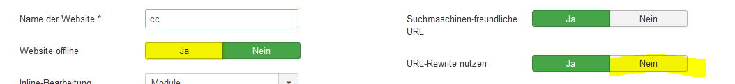
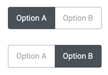
When using the class="btn-group" on a form element with type="radio", it is not clear which option is actually selected:
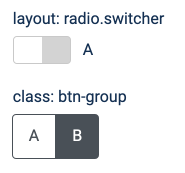
You win a prize if you can tell which option is selected in the btn-group example: A or B?
Well, answer is B.
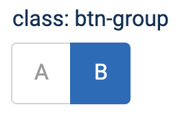
I suggest changing the styling to use blue for the selected option. And make the not-selected option(s) somewhat gray:
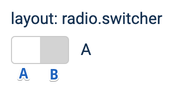
PS: radio buttons not using the switcher layout currently don't work in beta release. But is fixed in #32367
Votes
 joomla-cms-bot
-
joomla-cms-bot
- | Labels |
Added:
?
|
||


As you can see in the animated radio switcher: dark is NOT the selected option!
A simple solution:
Set the labels inside .btn-group.radio to opacity: .5;, and set the active labels back to opacity: 1;.

The blue color on the selected option instead of gray would be better as well, as of the original post by Peter

Please submit a pr
Seeing this would need a change in the css, I am at a loss.
There is no media folder in the repo and no idea where the template.scss grabs the necessary styles from or where to change the source btn-group styling.
I guess you need to find a real developer to help you use composer, npm and git :)
I guess so. So my job is done here. I reported the issue. If someone wants to fix it, fine. If not, ??♂️

For reference:
The source files for the media files are usually here: https://github.com/joomla/joomla-cms/tree/4.0-dev/build/media_source
However for templates, they are in the respective template folder (https://github.com/joomla/joomla-cms/tree/4.0-dev/templates/cassiopeia/scss and https://github.com/joomla/joomla-cms/tree/4.0-dev/administrator/templates/atum/scss
This is done so they end up in the distributed CMS and people can reuse them for their own templates.
Thanks, I got that for.
This whole styling is too baked in to bootstrap. So I am dropping this.
| Status | New | ⇒ | Closed |
| Closed_Date | 0000-00-00 00:00:00 | ⇒ | 2021-04-10 20:14:31 |
| Closed_By | ⇒ | regularlabs |
What you would like as solution? Isn't it a de-facto-standard that dark means "selected"?
In J3 we have for example this,which for me is more confusing.