Feeling Lucky
?
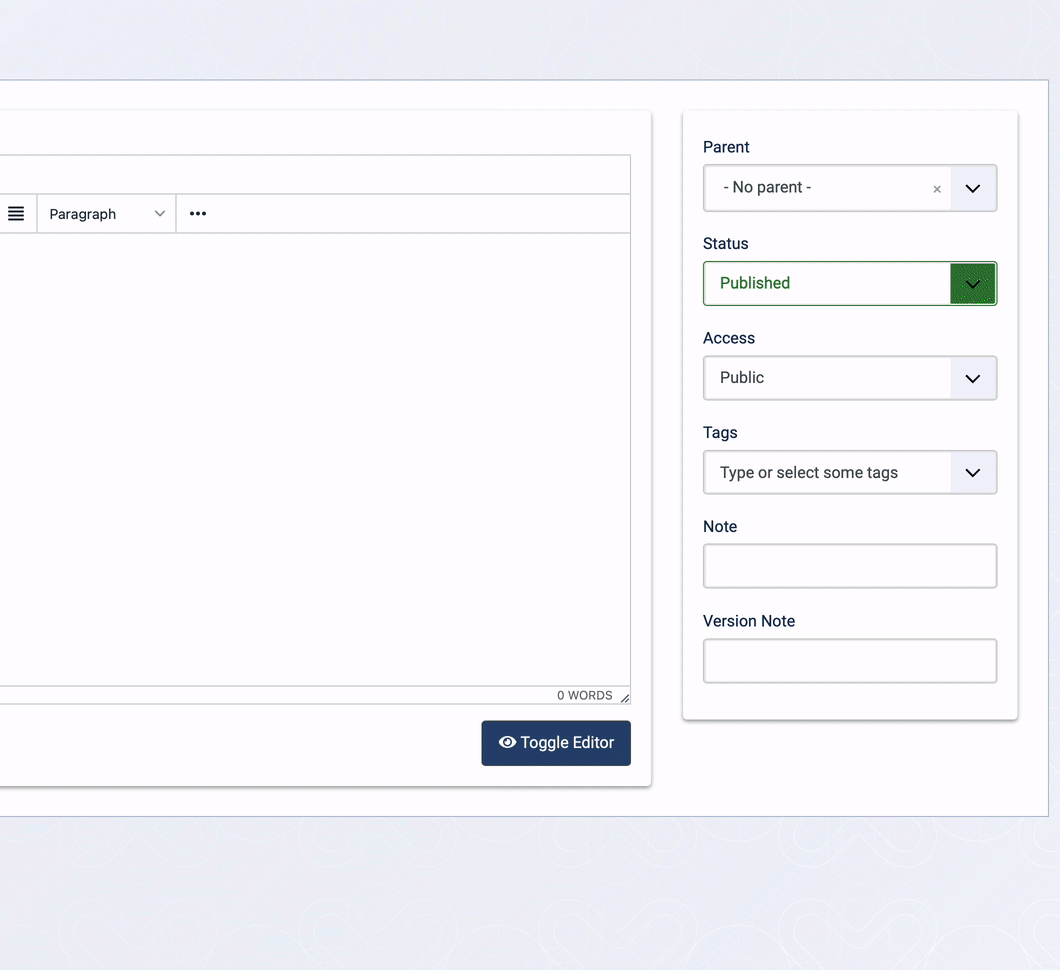
[#30895] - [4] Tags select box width breaks responsive design nature
- Closed
- 2 Oct 2020
- Medium
- Build: staging
- # 30895
Steps to reproduce the issue
Two ways - first is how I first saw it.
- Users -> User Notes -> New -> +Create (Category) = Modal
Depending on your screen width and responsive breakpoint verses screen your results will differ.
Screenshot taken on maximised browser on half the 27inch iMac screen. Approx Browser window size: 1600 x 1566 on Screen size: 3200 x 1800 - I.e a HUGE SCREEN for a browser
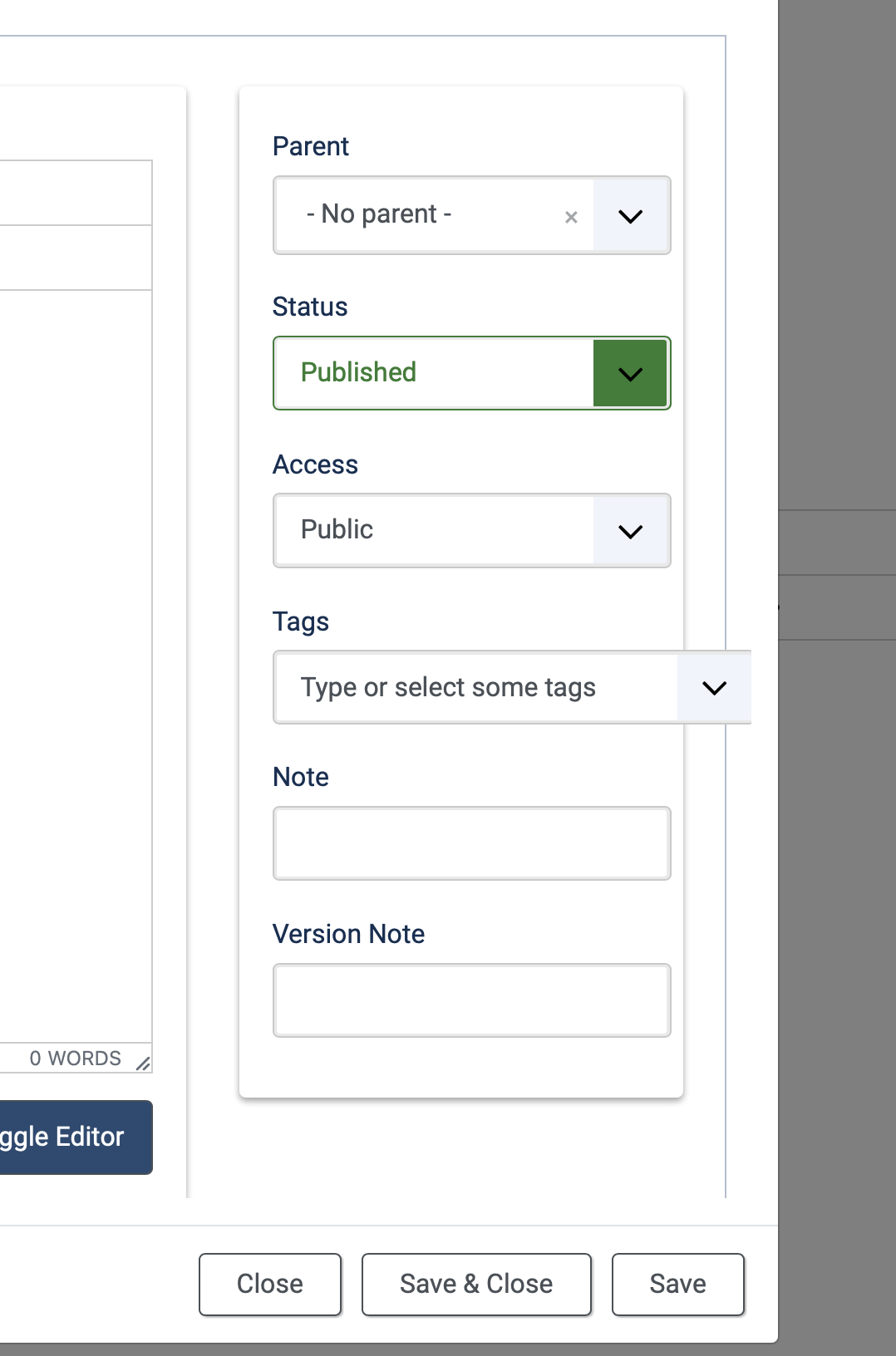
- This way is better for testing as you can "squeeze your browser" to different breakpoints to see the effect. The tags select box is much worse than the others and I think the only one that needs fixing.
Users -> User Notes Categories -> New
Expected result
That layout is sensible for all responsive breakpoints, and when loaded in modal windows
Actual result
Described above.
System information (as much as possible)
Safari on Mac
Additional comments
 joomla-cms-bot
-
joomla-cms-bot
- | Labels |
Added:
?
|
||

| Status | New | ⇒ | Closed |
| Closed_Date | 0000-00-00 00:00:00 | ⇒ | 2020-10-02 22:51:19 |
| Closed_By | ⇒ | PhilETaylor |

PhilETaylor
- comment
- 2 Oct 2020
Ha my search skills are crap tonight... I never searched for "choices" :-)
Duplicate #27907