[#29761] - [4.0] Fix select missing icon for removing the selected value
- Fixed in Code Base
- 27 Jun 2020
- Medium
- Build: 4.0-dev
- # 29761
- Diff
- Quy:29750-choices
- Pending Hound Hound is busy sniffing around... Details
User tests: Successful: Unsuccessful:
Pull Request for Issue #29750.
Summary of Changes
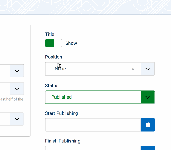
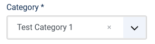
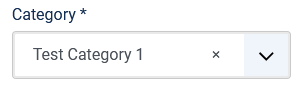
The x icon is the same color as the background color. Remove the color assignment.
Testing Instructions
Edit an article in backend.
See Category dropdown missing the x icon.
Apply PR.
Run npm i.
| Status | New | ⇒ | Pending |
 joomla-cms-bot
-
joomla-cms-bot
- | Category | ⇒ | Administration Templates (admin) NPM Change |

I have tested this item
Reason see my previous comment.
This comment was created with the J!Tracker Application at issues.joomla.org/tracker/joomla-cms/29761.

Darn it! Will investigate it later. Thanks.

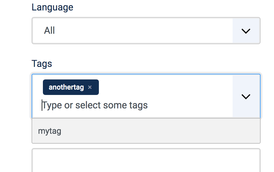
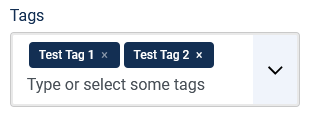
Without the patch I see the x barely visible in Tags. With the patch it is exactly the same. But why is Featured just a red No. That looks wrong.
This comment was created with the J!Tracker Application at issues.joomla.org/tracker/joomla-cms/29761.

This comment was created with the J!Tracker Application at issues.joomla.org/tracker/joomla-cms/29761.

color: inherit ?

This is what I get with color: inherit;
and tags look like
I missed the Run npm i. part. I don't seem to be able to do that with a nightly build. No package.json?
This comment was created with the J!Tracker Application at issues.joomla.org/tracker/joomla-cms/29761.
@ceford Correct, the nightlies are the result of composer and npm runs and so don’t include the build sources. What you can do for testing is you can use the package which is built by Drone CI for this PR. It is like a nightly plus it includes already the changes of this PR and the results of composer and npm runs. Am on mobile now so can’t provide a detailed instruction with screenshots on how to find that. You have to check the test result details at the bottom of the PR. There should be one test by drone called „Download“. Klicking that Link then leads to a page where you can download that package.
| Labels |
Added:
NPM Resource Changed
?
|
||
Fixed. Thanks.

As mentioned by others, the contrast ratio of the remove-icon is far from 4.5, expecially for tags. The colour should be the same as for hover.
This comment was created with the J!Tracker Application at issues.joomla.org/tracker/joomla-cms/29761.
I agree the contrast is not high enough with this PR when not hovered, but it is better than without this PR for the single select (where it was not visible at all), and not worse for the multi-select.
-
Single select, not hovered:
-
Single select, hovered:
-
Multi-select, left tag not hovered, right tag hovered:
So the PR definitely is an improvement to before.
I have tested this item
For me it's ok because it's an improvement without breaking something else.
But if some correction can be made for higher contrast, I'd be happy to test again.
This comment was created with the J!Tracker Application at issues.joomla.org/tracker/joomla-cms/29761.

Indeed you need to fix the contrast for the icon, otherwise it will be not accessible. Please fix it and we will test it.
@chmst Is there any accessibility rule telling that when having a color difference between hovered and not hovered, then this difference should also have a minimum contrast ratio?
The color contrast is not sufficient for small characters (icons). It should be 4.5:1.
SC 1.4.3, It could be considered that this situation falls under criterion 1.4.11 and then a 3:1 contrast would suffice. But this is an important element of the interface, so it needs to be improved.
Also, any visual information necessary to indicate state, such as whether a component is selected or focused must also ensure that the information used to identify the control in that state has a minimum 3:1 contrast ratio.
This tool is extremely handy when testing contrast: https://webaim.org/resources/contrastchecker/
--
JAT
Thank you very much for your reply @richard67 .
You set your first test as a failure due to the lack of enought contrast:
the cross icon is almost invisible e.g. for the tags selection
It's just a matter of widening the range of people for whom this will still be invisible after the change.
We cannot provide a successful test for this if we see A11y issues with it.
--
JAT
@carcam The first test was before a correction was made and was negative because the PR made thins WORSE than before for the multi-select. After the correction, the PR doesn't make anything WORSE at any point but BETTER at some point. That was my criteria, if a PR improves something without breaking something else, or if not.
We can't expect a PR fixing ALL accessibility problems of some functionality with bad or broken accessibility just because it is touching a part of that function. If we expect that, then we need for every change a css expert, but we don't have so many of them.
@richard67 Thank you very much for your comment.
I do disagree with you in this case. We are not expecting to fix all A11y issues with this PR. We have just pointed out there might be a contrast issue that needs to be addressed (exactly as you did in your first test). From your point of view it makes things better, but for some users it will mean no change, and the amount of effort needed to make it good enough for everyone is not that much.
--
JAT
I stand by my test result and the criteria I‘ve described: In the first test the PR made things worse at one place, in the 2nd Test not, and on both cases it solved the issue it claims to solve, the invisible cross button for the single select. Before this PR I did not even know there is this button, and so I always cleared my selection by using the drop down and selecting the „Select ...“ value at the top.
I understand your arguments.
But as we have stated, this only solves the problem for some users and not for all of them. For lots of people the cross will keep invisible.
The fix is really straight forward so I do not see a reason to not improve this PR.
In any case thank you very much for a healthy discussion!!
--
JAT
@carcam Well, we are aware of that problem now and we agree it has to be solved, we only disagree about if it has to be done with this PR here or not.
The problem I could see when inspecting the markup and css (but I am not the very expert in that) is that we don't have really some css class for having a selector which allows us for such a "X" button to distinguish if it is shown in a single or a multi select variant of that fancy select. If this is right, the fix could require some PHP changes to add such a class depending on the single or multi select property of that fancy select box, or we have to change color of the inherited background, too, but this would then mean we also have to change colors of other elements, too, so they have the same grey (or whatever else) border colors.
I don't want to block a PR by requiring changes far beyond the scope of the PR, that's why I think that if my assumptions above are right, it should be done with a new, separate PR. If my assumptions are wrong and it can be easily fixed with this PR, then I am happy of course.

Hi @richard67 I do understand your points. It's just that I disagree abou the "scope" ;)
Anyway, we have retested the contrast in the team and we were wrong in our initial tests (npm ci thing). Contrast is good for WCAG 2.1 AA so we have nothing against.
There are other possible improvements to make this even better with AAA but that is definitely beyond the scope of this PR and no changes are needed if other sucessful test arrives ;)
Again Richard, thank you very much for the healthy discussion ;)
JAT
I have tested this item
New color offers enough contrast ratio to be AA compliant.
Foreground: #8997A9
Background: #132F53
The contrast ratio is: 4,53:1
1.4.3 Contrast (Minimum) (AA)
Pass for large and regular text
1.4.6 Contrast (Enhanced) (AAA)
Pass for large text only. Fail for regular text
1.4.11 Non-text Contrast (AA)
Pass for UI components and graphical objects
This comment was created with the J!Tracker Application at issues.joomla.org/tracker/joomla-cms/29761.
| Status | Pending | ⇒ | Ready to Commit |
RTC
This comment was created with the J!Tracker Application at issues.joomla.org/tracker/joomla-cms/29761.
| Status | Ready to Commit | ⇒ | Fixed in Code Base |
| Closed_Date | 0000-00-00 00:00:00 | ⇒ | 2020-06-27 10:07:19 |
| Closed_By | ⇒ | infograf768 | |
| Labels |
Added:
?
|
||
Tks.

Sorry for being late to the party but this is not perfect :(
Safari on Mac with Joomla 4.0-dev @ 5b9d0f2 (today)
The X is too far left.

To replicate just install the above and then edit the first module on the home dashboard after login
Also the actual "clickable area" appears to be HUGE!
see:

@Quy The problem is that with this PR, the cross icon is almost invisible e.g. for the tags selection:
Without the PR it looks like this: