[#22972] - [4.0] [UX] Installation labels are too long
- Closed
- 10 Apr 2019
- Medium
- Build: master
- # 22972
I'm opening another issue for this as I still stand by what I said when the new installer was released.
The labels are too long from a UX perspective.
For example:
Set the username for your Super User account
Labels are not help text and should not contain a sentence, but instead a word or two.
The label should be:
Username
and if you think there will be users out there that don't know which user they're setting the username for, then create a help text box below.
A prime example of this was Amazon. They used to have a sentence for their registration labels which resulted in slower completion rates.
The same applies to other fields, such as Password, Email, and the database settings.
 joomla-cms-bot
-
joomla-cms-bot
- | Labels |
Added:
?
|
||
 brianteeman
-
brianteeman
- | Labels |
Added:
J4 Issue
|
||


- They make sense but are simply unecessary. It's now taking longer for power users to complete the form as there's more reading to do.
- I'm pretty sure a form field can be made accessible without the need for longer labels.
When I can install Joomla 3 faster than Joomla 4, I know something is wrong. The whole point of the Installation improvements was to speed up the process

You're never going to find a happy medium. The labels now are "too long" for you and probably other "power users", shortening it like you're suggesting and making liberal use of help text has the concern of alienating "average user" and making the screen seem more busy by requiring more reading in more spots.
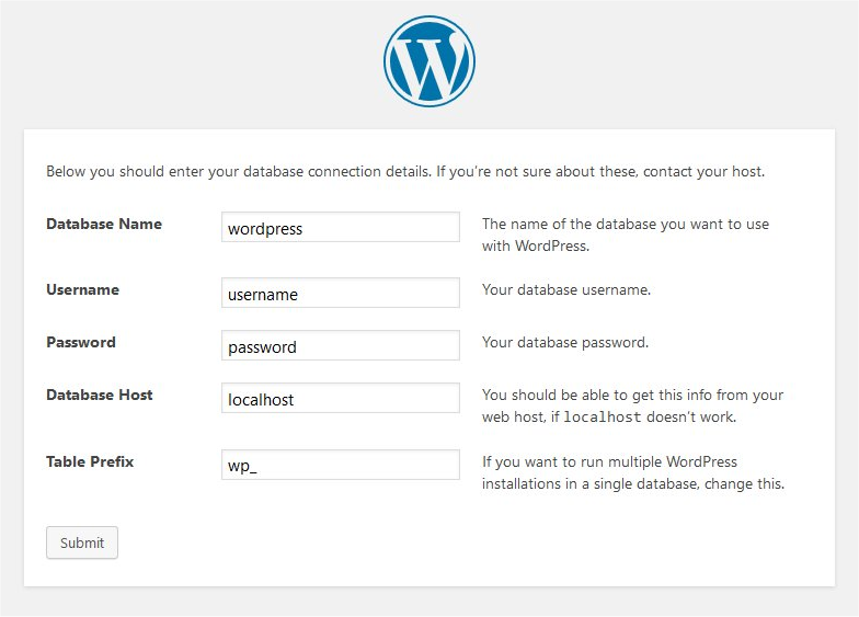
I remember at one point suggesting an introductory sentence on each block so you get rid of the repetitive bits (i.e. in the user account block a intro that says "set the information for your site's administrator account" then the labels can be the simple strings you're suggesting), that went nowhere too. The WordPress installer IMO demonstrates both the intro sentence with simple labels thing, as well as making the screen too busy with text all over the place; BUT, with their column based layout you can rather easily ignore the extra help text (whereas if we're following the Bootstrap 4 design on forms help text is always underneath the input and generally smaller text, making it harder to find as well).
Power users will install the cms without even looking at the form...
Actually, since this is a pattern that many people keep repeating (power users vs normal users) I have to say that the whole idea is flawed from any perspective, UX, UI, A11Y, you name it...
Either you build something that works for everybody or your design already failed.
That said I don't see how the form design in the installer is flawed because the labels are long.
I mean the installer is supposed to be the first introduction to the product for the majority of the users (as the idea was that the CMS will expand and attract more users). The idea that the installer is some piece of known software falls down to the idea that it is fine that the CMS will keep shrinking its user base. Thus will ever be the used only by people that already used it some earlier version...

can I work on this???
please do.
I can't see why the labels can't simply be kept to 1 word with a mini description below the input in a slightly smaller/light font
@C-Lodde Can I do it like "Username of Super user"
Personally I feel most of the field labels can be kept to a single word, e.g username, password, email, etc.
As long as the installation page that the user is currently filling in has a proper heading, e.g "Super Users details", there's no need to use several words for labels
I’m against this. We spend 2 days in London making sure that the form is accessible and changing the labels back to the previous, non self explanatory, labels will just undo that work and eventually break the accessibility. Honestly I don’t get why people have an argument with the length of the label. It was done in such a way to be inclusive, so I really don’t get why we should go back to the previous State, were only people without disabilities are happy.
It may be accessible now, but at the end of the day, I'm providing my own personal user experience based on it taking longer to scan the form.
That said, if UX feedback is no longer essential and overulled by a11y, then I'll happily close this.
Well, to be inclusive you have to make compromises. So right now this works for all users now. Changing to single word will be faster(?) for the ones without disabilities but you totally loose the visually impaired.
Also speed reading is not the case here, we're talking for 3 inputs all and all on each form. Do you want to improve this? Here is an idea: decorate each field so you can visually scan faster...
Anyways, again, destroying accessibility is not acceptable IMHO...

We have already discussed this issue. All the arguments have already been formulated.
We have agreed that it is better to use slightly developed labels instead of short labels and additional explanations. That is better both for usability and for accessibility.
However, C-Lodder is right. Some labels are too long. You can shorten them without losing content.
Others are poorly built. They can be reformulated to make them more meaningful.
My English is weak, but for example:
Don't write: Enter the name of your Joomla site
Write: Name of your site (4 words instead of 7, same content)
Do not write: Set the username for your Super User account
Write: Username for Super User (4 words instead of 8, same content)
When I scan, I read the first words of the paragraph. That's why I start the paragraph with a keyword.
Don't write: Either a username you created or a username provided by your host.
Write: Username, where you created or provided by your host.
Now this is not an accessibility problem. This is just a usability problem.
But when you want to add additional explanations, tips, you will have accessibility problems.
@zwiastunsw but the issue here is that the labels are not single words not shortening them. Thus my objection, I'm fine if someone rephrase them but keeping the natural spoken/written language rules (verb, etc) so it makes sense for those using VoiceOver or other such programs...

@dgrammatiko : I agree with you. But the examples I gave show that they can be shortened and can be more communicative. Users know that they fill in the form, so they don't need words: Enter, Set, Select etc.
@PhilETaylor: Full agreement. It should sound like that:
Database type, usually MySQL
@PhilETaylor that sub text is not accessible, eg will never being announced in voiceover so basically you discriminate visually impaired people...
But on the point you make, yes I agree that any text should actually make sense or don't display it at all

you discriminate visually impaired people
Not me personally. I'm just making the point that A should not equal B. If something has to be said, say it once in the right place, not one in the right place and then again "just because we need help text to make it look pretty"
say it once in the right place
Yes, yes, yes!
@PhilETaylor you === we === Joomla. It wasn't personal...
@dgrammatiko I never said all labels should be 1 word. Some of them can be, but the post title clearly says:
[4.0] [UX] Installation labels are too long
You can still have a fully accessible, simple installer with good UX. One isn't more important than the other

a word or two !== single word
The key to a good form is small concise wording for each field so it can easily be scanned/read.
The form consists of 3 inputs, so really what speed reading improvement you'll expect to get out of this? Also I'm quite sure that nobody wants to fulfil the form in a hurry as this is prune to errors and thus will take much to longer time to resolve the errors (eg reinstall)
@C-Lodder & @dgrammatiko: Do not argue about words. The essence is important.
One more argument for: @dgrammatiko:
Screen reader tells the user: Edit
So don't say him: Enter, Set, because it's a redundant repetition.
The reader says: checkbox (or otherwise depending on the control)
So don't say: Select, because this is a redundant repetition.
My conclusion: the UX can be corrected, but labels must contain all the information, without the need for additional explanations.
but labels must contain all the information, without the need for additional explanations.
+1000
If you group different parts of the form, e.g Database, Super User, Languages and these are grouped using proper semantics that a screenreader can sift through, then the labels won't require the additional explanations as per the current state.:
http://jsfiddle.net/Lfv4ura2/2/
Check the link above with a screenreader. You'll notice it reads out the form legends for each group.
It's just basic HTML semantics, there's nothing difficult about it.
Again, there are 3, THREE inputs, so what's the benefit on having one word labels there?
Sorry I can't follow you because I don't see any actual benefit or an actual problem with the length of the labels
@C-Lodder answer:
Do you need information such as:
- Database type: usually MySQL
- Hostname: usually localhost:
- Database User: own or provided by your host
- Database Password: own or provided by your host
etc
Why create two texts (label and hint) when you can create one slightly longer text, accessible to all?
Also: Have you conducted usability tests with users? Do you think that's the only way to do it. I suggest. Conduct tests with people who have never installed Joomla. Conduct tests with users with disabilities. Use different labels.
Again, there are 3, THREE inputs, so what's the benefit on having one word labels there?
Sorry I can't follow you because I don't see any actual benefit or an actual problem with the length of the labels
Constant repetitiveness. In the username and password fields there is exactly one unique word between the two of them, with labels of eight words each. If the email address field used the same boilerplate, that would mean you have three form fields right next to each other where of the 25 printed words that four of them are unique. This indicates to me the section can be written in a more efficient manner. Whether that be single word labels or something else doesn't really matter, but repeating the same text that frequently looks like a problem.
Just print the placeholder with the single word Username, Email etc. There problem fixed...
About the labels, as Armen and also @zwiastunsw said: labels must contain all the information, without the need for additional explanations.
If the text on these labels is wrong (Armen's native language is not English) then fix that but keeping the idea that all the info should be within the label
Then write labels that aren't 84% repeated text because right now for all intents and purposes the user account section is basically sprintf('Set the %s for your Super User account.'); and I honestly can't believe THAT is good for UX or accessibility at all.
Also, what makes the behavior of the installer separate from the behavior of, say, the com_content edit screen, where short labels are very frequently used? Why is "title" in that context an acceptable single word label but having "username" as a single word label in this context not?
Why is "title" in that context an acceptable single word label but having "username" as a single word label in this context not?
So who said that Title is acceptable? That label is carried on from 3.x without any changes or touches from the a11y team. I guess once they review the forms those labels will be changed as well...

So who said that Title is acceptable? That label is carried on from 3.x without any changes or touches from the a11y team. I guess once they review the forms those labels will be changed as well...
You don't seriously want to add " of article" to each of those fields.
Ok, I'm out of here...
 franz-wohlkoenig
-
franz-wohlkoenig
- 
| Status | New | ⇒ | Discussion |
| Category | ⇒ | com_installer UI/UX |
| Status | Discussion | ⇒ | Closed |
| Closed_Date | 0000-00-00 00:00:00 | ⇒ | 2019-04-10 07:43:23 |
| Closed_By | ⇒ | C-Lodder |
@C-Lodder the labels are longer because: