[#14326] - UX - Joomla! 4 - two clicks to "Save and Close" instead of one in Joomla! 3.x
- Closed
- 23 May 2018
- Medium
- Build: master
- # 14326
Steps to reproduce the issue
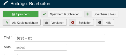
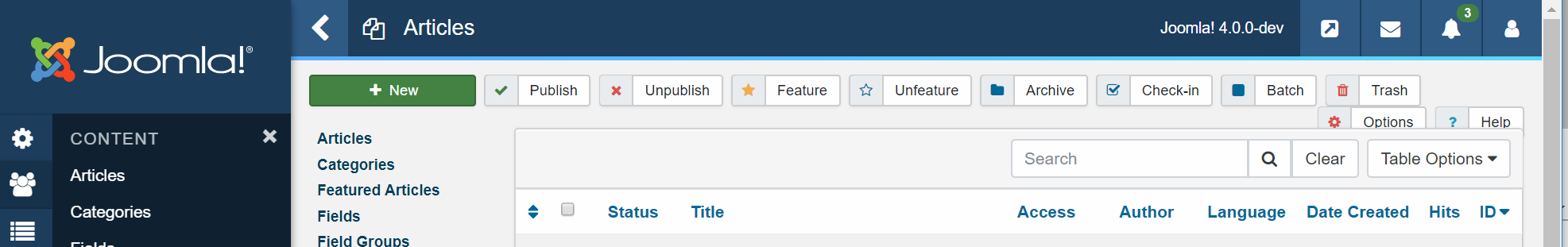
Go to articles, create new article and click on "Save and Close" button

Expected result
- Save and Close button will be standalone button
Actual result
- Save and Close button is not standalone button - one more click needed to save and close the article
System information (as much as possible)
Joomla! 4, PHP 7, MySQL 5
 joomla-cms-bot
-
joomla-cms-bot
- | Labels |
Added:
?
|
||


We need to get user feedback on this and research materials are in development now.
I personally use those buttons frequently, and I know many people do as well. I also like the cleaner interface with less buttons, but we may need to approach this in a different way.

and research materials are in development now.
What do you mean by this? The development is done this is the state in the 4.0-dev branch there is no need to develop something? Or i missread something? ;)

+1 to look at this and other issues in admin ui in 4.0. i do agree it looks, for now, much less practical than what we have now in the 3.x series.
The development is in progress, nothing is written in stone at this point. We are just beginning to get user feedback on the new interface, and based on user initial user feedback there are a number of details we need to take a deeper look at, such as this one.
UX improvements are based on discovering what is best for our users. Many of our users are integrators who are not on Github, nor will they ever be. We need to discover how these types of changes will impact their work flows before we commit to anything. The production decisions should follow the user research, otherwise it's not a user centered development process.
are we considered as users?
Of course. We're all Joomla users. However, we are not the only users and large portion of our user base are not developers and are not on Github.
Joomla has a robust UI to provide a code free experience which users at all levels can utilize, that is why we have so many integrators. If we don't consider their perspective then we're only developing for developers, and I don't believe that is the mission of the platform.
We need to bridge the gap between our integrators / end-users and the development community in the production process and this where it starts.
Ah you develop the research materials sorry for the confusion. Yes please go for it

Anyway, in my case, all the UX feedback, I made, was based on discussion in our Joomla! community (mostly end users and web designers). It can be misleading (as I am Github user and "developer") but in this case I speak on behalf of the community (even it is very small).
And of course, regarding this feedback or other UX feedbacks, it is not that we say, something is wrong and should be done other way strictly. In fact, we feel the same like @cpfeifer : It is better to have less buttons or do less clicks? "Save and Close" button is often used. In this case we rather prefer the function - standalone button - than less button design.

If People can choose, everythings fine. One choose "less Buttons", other "less Clicks", i would choose "Shortcuts as much as possible" and "less Buttons".

I've already implemented keyboard shortcut for save (ctrl+s) for j4. Probably this button should have as default action the "save and close"
@franz-wohlkoenig the problem with joomla's UX was always the countless options.
I see that users keep asking for more options.
IMHO Joomla will get friendlier if the options are minimised and that will also make the workflow a lot more predefined (similar to wp), the downsize on this is that we loose flexibility. So at the end it's a balance...
Dead easy applications are the ones that are self explained, and Joomla is miles away from that, keep adding switches also doesn't really help...

@franz-wohlkoenig front editing is so wrong in joomla...
I have a working prototype for inline editing which eliminates all these inputs but I'll wait to see the UX teams approach before I'll make a PR for that
@franz-wohlkoenig @dgt41 To much options is something why users leave Joomla!. Even options are great to modify your CMS like you want and need, what is much is to much. New users in Joomla! are mostly shocked by Options everywhere and by the overrides. :-(
I see that users keep asking for more options.
Yes, this is right, but everybody is asking for his/her options (options for his/her needs). So others get options which were asked by others. Someone doesn't know to do simple edit it CSS so he/she wish implementing of new parameter which is then annoying for others (and for the system itself - every new parameter is large ballast for the system).
annoying for People they know how to modify an *.css correctly. People without this Knowledge are lost.
This was an example. We can speak about any other part of the system the same way.
Less clicks is always better, and too many options can be a bad thing, but we need to find a balance. We don't want to create more clicks in a workflow, but we also can't arbitrarily remove or group options without considering the consequences. Most used features should be front and center while the lesser used options can be hidden away.
Ideally, the default should be the configuration which makes the most sense to the most people, then others could customize to suit their needs. What we need to discover is the most useful default configuration before we can say one way or the other, and that is the goal right now.
What we need to discover is the most useful default configuration ...
whats the Focus:
- Frontend: User without Knowledge wants to create an Article, append a Picture and a Link
- Backend: User without Experience in an CMS but wants to learn.
@cpfeifer the most useful default configuration depends on who will we serve by default. I'm voting for me 6 Years ago.
@cpfeifer @franz-wohlkoenig @dgt41 @infograf768
What about common sense?
The button Save and Close (or others) was added to Joomla! because users wanted to save one click. Instead of clicking on Save (first click) and then on Close (second click), you just click on Save and Close only (one click only).
So now we added back two clicks - in fact we have cancelled the reason for having Save and Close
History:
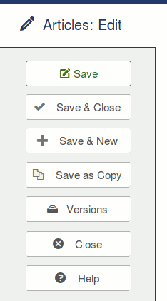
- Save and Close button does not exist: 2 clicks needed to save and close the article
- Save and Close button added to Joomla!: 1 click needed to save and close the article
- Save and Close button moved to submenu: 2 clicks needed to save and close the article
The logic says that Save and Close button in current form is useless.
The purpose of Save and Close button is to save one click. If it does not save one click, its existence is unnecessary. Its only impact is to be stand-alone button.
That's a good point.

Not completely true @PhocaCz we have stopped a page render which is the main issue with usability when clicking save and then close.
We could show the save & close etc on however? thus avoiding the click.
The idea it trying to remove excessive buttons causing a mess.
We should look at hiding more of the right hand less used icons in a more type button in my opinion.

The idea it trying to remove excessive buttons causing a mess.
personally, save, save & close, cancel - these three always should be visible, as most used,
the hover is not a solution, because it also require to do more moves, and does not work on mobile
@Fedik I'll argue that one I'm afraid.
-
the hover whilst doesn't work on mobiles it also doesn't require move moves, yes it means you need to move the mouse a cm to click the actions but that's here northere.
-
Mobile isn't a concern since at the moment you need click a button to see all the actions. this would be the same point as it is now, but seeing all the buttons in one view since we have the ave etc under one.
I'm not saving hover is the way to go, since I'm not sure on it's accessibility. But it's a option that's all.
Many thanks
Tony
you need to move the mouse a cm to click the actions but that's here northere
1cm it is a loooooot
the steps with 2 click: click to open sub-menu; move mouse; click the button;
the steps with a hover: hover; move mouse; click the button;
standalone button: just click the button;
but with mobile, maybe you're right
| Category | ⇒ | UI/UX |
| Status | New | ⇒ | Discussion |

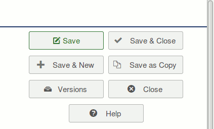
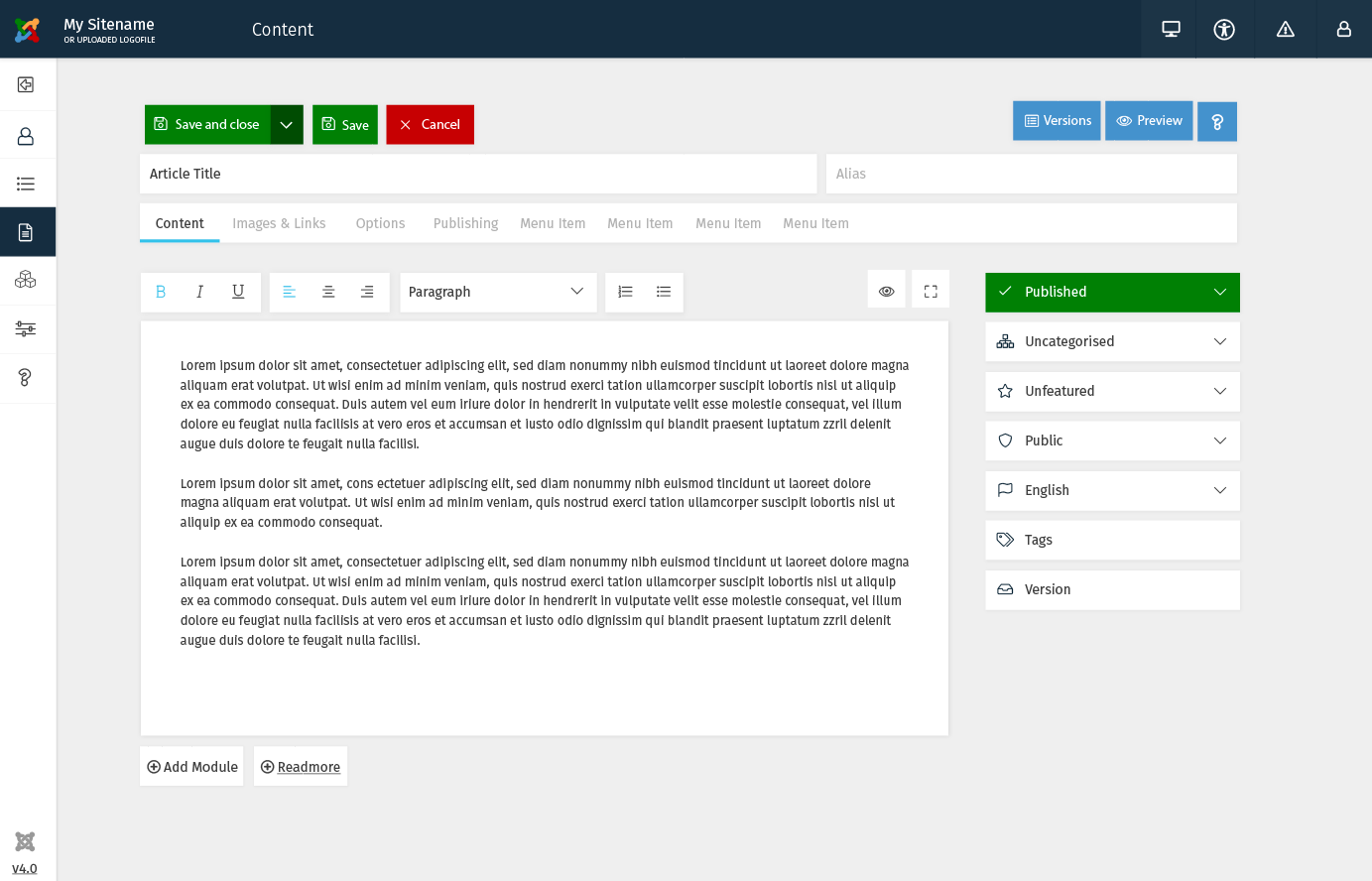
I am in favor of the "Save" and "Save & Close" buttons being visible always. But if we need to condense the various types of Save buttons into a single spot, could something like this be set in place...
Original:

Proposed (if we need to still condense the buttons into a single spot):

@justinherrin
Hi, it is not about the name: Save vs. Save & Close.
It is about the function. The Save & Close button was added into Joomla! because of saving one click (instead of making two clicks: 1. Save and then 2. Close, you click only once on Save & Close). Moving it to sub menu will cause loss of the essence of the Save & Close button.
The purpose of Save and Close button is to save one click. If it does not save one click, its existence is unnecessary. Its only impact is to be stand-alone button.
See: #14326 (comment)
@PhocaCz I'm well aware of the advantages of having standalone "Save & Close" and "Save" buttons, in fact I recommend it. But I was simply suggesting that IF the UX team is determined to go the submenu route, that they change it so the "Save & Close" button is the primary green button which can still be clicked once to work.

My2Cent: @justinherrin The administrators I am teaching Joomla! do not know what "reload" means.
For Designers the many buttons look like a mess. For novice users it is better to see at once what they can do. For experienced users, one click is better/faster than two. So I'm voting for a stand alone "Save and close"
+1 for "So I'm voting for a stand alone "Save and close"
- 1000 indeed. When one wants to use these sub-buttons, we now have this tiny arrow to click on and I most of the time miss it and Save only...

Regarding form, how about one of the options below:
http://demo.jux.space/save1
http://demo.jux.space/save2
I'm sure a talented designer can improve on the looks.
As for naming, "save" is pretty straightforward.
I'm against "save and reload" because it doesn't help in any way.
Every software, when you hit "save" you stay in the same screen, this is known behavior, and contributes to usability.
And having "save and close" right beside it explains what just "save" means.
@chmst is right, by adding "save and reload" you'll make a lot of Joomla users confused (I'm not referring to developers, who can just deduce its meaning).
For mobile, once the user gets used to what each button icon means, the layout can be kept, disregarding the hover, since the icons are pretty much straightforward and everything is enclosed within the save button context, with color differences to imply further, but related, actions.
I've opened an issue at the JUX github to treat this.
The main issue here @jonrz is the page actually reloads. We shouldn't be doing this and would advise we should setup an alternative save method which does it via AJAX/JSON, sends all the form data and a Joomla! Loading icon popups whilst it saves at which point we output the notice. Chances are it will be 1/4 of the time of a page reload improving performance. As it is J4 we can likely get approval for this, we couldn't in J3 I believe due to browser support.

@tonypartridge thats not really relevant to the title and original post is it? (Not that I disagree that it would be a good thing to have)
I like this example http://demo.jux.space/save1 ,
the idea and style, but not JavaScript wich used for it
@brianteeman with the debate about save & reload vs Save to me it is, since it eliminates the need for a Save & Reload change. And thus Save is perfect usage case.
I like this example http://demo.jux.space/save1
I don't. What are these tiny icons for? No idea before testing them one by one. It's also still extremely easy to miss the one you want and click on the neigbouring one => therefore not get what you want to do.

Hmmm. AFAICS the button caption changes, on mouseover of the icons, making it extremely clear. I like this, a lot but it needs some work.
Tab order is not the same as the display order of the icons.
It would be good if the icons would highlight on mouseover/tabbing, both for clearer display and for better accessibility.
The text caption needs to change on tabbing, as well as mouseover.
Accessibility: missing aria-role, aria-label and aria-labelledby attributes - no discernable text for screen readers.
@Fedik I'm not a coder. This is a starting point for a talk on the subject.
This is an idea of a compact view that occurred to me when I did a mockup for the article.
Actual code needs to be accessible, clean, and thoroughly tested.
@infograf768 This is a starting point, and I said a designer could improve the looks.
Of course size would need to be adjusted, but not that much (except on mobile, where we need something easily tappable. Is that a word?)
@tarotray This is a crude code, just a starting point.
Tabbing and accessibility will need to be baked in. I'll ask Armen to step in as soon as we have something more closely resembling a final solution.
@tonypartridge The reload doesn't matter, actually.
When it reloads, there is an "article saved" message, and that is more than enough.
Most people still expect a reload when they click something in the web, so usability-wise, we're OK.
That might change in the next few years, and having a reload-less save would be the best.
As for the reload-less save, I'd recommend adding a dark overlay with a spinner and a saving message if the save takes more than, say, half a second, unless you can tell me that nothing the user inputs or clicks during save will be lost (I don't see why something would be, but I'm being extra cautious here, thinking about modals with options, such as the menu type selection).

On this image http://demo.jux.space/save1/ would the title field appear on hover to tell you what the various buttons do?
The buttons as @infograf768 suggests are too small.

What about reverting the save buttons so they're separate again, then put other buttons such as:
- (Un)Publish
- (Un)Featured
In a dropdown named State
and other buttons, such as:
- Batch
- Archive
- Check-in
- Trash (although this could go in
State)
in another dropdown named Actions?
Other than that, and this is a major long shot but still worth a try, building a small script that counts the times each save button is used (store data using HTML5 localStorage). Which ever save type is used the most, gets displayed as the main button, and the others in the dropdown.
oops, edited the list.
To be honest I'm easy. Just throwing proposals out there :)
Which ever gets agreed on by UX
Wait, I think I'm mixing things here.
One thing is the list (no save button), other is the edit screen (no batch or check in for example).
I'm thinking about the save screen for now. Also there is this for the edit screen:

Check again, forcing a refresh. Did a color change.
Again, a designer will certainly make it look better.
Guys, can you please follow the rule "form follows function"!
What is the expected functionality that you want? ( I m in favor of smart toolbar: showing only buttons that make sense e.g. If an article is published show only the unpublish button)
If you try to fix the functionality by different mockup you definetly gonna fail!
@dgt41 Dimitri, we are definitely trying.
A smart toolbar is great, but on some places, usability calls for a toggle, to make the function crystal clear to the user. That will be the case mostly on edit screens for options such as (un)publish.
On list screens we can definitely do smart buttons, but what if the user selects items with both states? Will we waste space with two buttons being displayed, when we could have a condensed one?
This is food for thought, of course. Usability tests will decide.
What we are doing at this phase is gather people input on good ways to present the interface elements, and all contributions are welcome. We will test both current and proposed solutions.
I have one question: what would be the cost (programming effort versus resources+time available) to implement such a smart toolbar? We are trying to do most things within the deadline, and well within reach of current tech/implementation.
@infograf768 better size?
What will happen when some text is longer than the box-size in some languages? Will the button extend?
@infograf768 yes, it would be silly to have a button with a fixed width on a multilinaugal site.
not just multilingual - any site not in english ;)
well, you get the idea
sure
@infograf768 Don't look at the code, it will burn your eyes.
Function, then basic form, is what we are evaluating here.
I know the code have a fixed width, but that is to prevent the button to change width (then moving icons) when replacing text in this specific quick hack. I'm sure there is a better way of doing this with Bs4 or flexbox or whatever to size it according to the lengthiest text string, whatever the language.
This problem is still available in version 4.0.0 Alpha 2
To summarize it:
Hiding a "Save & Close" command is a nonsense because this command should save you one click (instead of making two clicks: Save and then Close, you just do one click when clicking on "Save & Close" button - this works in Joomla! 3.x)
But at the moment - in Joomla! 4 - you need to do two clicks - first click to open the sub menu and then click to "Save & Close".
It is something like activate remote keyless entry after opening the car with mechanical key.

Most of the time I need save & close, now to have to make two clicks makes it not better
@coolcat-creations @ciar4n what are your thoughts on this? Did you want to have a skype call some day to look at all the possible solutions for the toolbar?
The dropdown buttons are still a consideration for the new toolbar (obviously not for the save+etc), or I got this awfully wrong?

They are still consideration, especially for the Actions, we save a lot of space with that. We should have a longer Meeting :-)
Weren't the UX team researching this?
who?

One former member of the UX Team was, among other things, advocating for moving away from the two-click Save & Close requirement. For doing so he was removed from the team.
only removed? happy that member was not sent to guantanamo or siberia...
where can we see a list of members of that guost team?

The both most used buttons can be there, and if someone doesn't want just to close the article but do something more he/she could select from a list what will happen. (Two Features in a later release could be to edit the next Article in the Article Manager List with "Save and Next" or to Save the Article in all Languages with Associations.

My 2 cents... I don't see the need to place these buttons in a dropdown. It creates extra clicks for little or no gain. Maybe I am missing something?
Mobile friendly has become mobile first. The intent of the dropdown is to save space on tiny screens.
Because of a button forrest... Sorry the screenshot is german, but is shows the problem...
Then lets find an alternative solution for smaller screens only. The majority of admin use is on desktop and should not suffer due to mobile only issues.
I don't think it's only a mobile issue. A user gets confused fast, if there are too many possibilities, let's keep the UI as simple as possible and not add to many options on the first view.
The button forest could be displayed differently.

Lets do some mobile handling not only at browser side,
but also at server side during PHP execution and create different HTML at least in forms

@rgmears it's not about a different alignment. It's about too many options. If you are in a restaurant and the menu has too many options you need longer to decide what you want. It's better to reduce Options on the first glance. That means a faster orientation for the user and a cleaner Interface.
Therefore i prefer 1)
Edit: Additionally to that we would not need to worry if we add another Save Option Like Save into Workflow, Save and Next, Save and Translate and what ever... Possibly 3rd Party could even add there a Save and Tweet or Save and Post Feature.
THIS IS NOT ABOUT MOBILE!!
THIS IS NOT ABOUT DESIGN TWEAKS!!
This is about the user experience
We need to keep the screen clean and not boated with options
"Power in simplicity"
For an example see this screenshot at 1350px
Here's the same thing (without the side menu) also at 1366.

@coolcat-creations
In a restaurant you may only visit sporadically. When using a CMS you may visit regularly. The comparison doesn't work. Plus, muscle memory kicks in at some point.
@rgmears It get's even more importance if you see something like that everyday. If it annoys a person already at the first visit it will increase the annoyance later even more.
See at @brianteeman screenshot - we have to avoid such overflow of buttons everywhere.
Same with your screenshot, it's nothing i want to get used to - sorry, it's just too much.
@coolcat-creations you and @brianteeman are missing a significant point here. It's the excessive use of colour that causes the confusion. And I have no problem with a cluster of buttons, all of which are easy to find and click on. Especially when the screen gets bigger which is what I work on.

No sorry, I think you miss the point of simplify and de-clutter an interface. And you miss the point here that we have a vertical menu in J4 too.
And you miss the point here that we have a vertical menu in J4 too.
In edit view we don't have the menu, so it might worth the idea to make the toolbar resemble the menu?
That could be "maybe" done, but not with thousands of buttons in there.
Second: how is it solved mobile, save options only in offcanvas?
And you miss the point here that we have a vertical menu in J4 too.In edit view we don't have the menu, so it might worth the idea to make the toolbar resemble the menu?
That could be "maybe" done, but not with thousands of buttons in there.
I guess the edit view has 5-6 buttons max, so it might worth exploring the idea
If we do so we have to move every toolbar to the menu not one time here and one time there.
Also Article Overview, Category Overview etc.
I discuss with the UI Team to have a second draft for this approach.
That could be "maybe" done, but not with thousands of buttons in there.I guess the edit view has 5-6 buttons max, so it might worth exploring the idea
Also Article Overview, Category Overview etc.
Then NO! a toolbar next to the menu will be another huge cluster@uck
Phone looks like this

tablet looks like this

I'm late to the party, but I'm in full agreement with Brian (hey, for once...), and Elisa.
If we concatenate the secondary save options under one dropdown, despite the extra click, the user will instantly KNOW that all those options are save-related.
If you have a whole bunch of buttons, like Robert is proposing, the chance of the user having to fish around for the correct one for the task is much bigger.
Also, the extensively discussed "muscle memory" factor. Several buttons side by side will not help that, plus there are users who can't properly develop a good muscle memory (well, most of them can't, actually), plus we need to account for external factors, such as distractions/multitasking, etc.
A single, big-ish green button with a clear name "Save and stay" (see below), or just "save" (whatever), and a very clear dropdown provide a much clearer mouse target, and a much smaller "search area" for locating the desired save action.
One extra click is only a hassle for content input professionals who will add dozens to hundreds articles/menus/modules a day. And for that we may even have an option to set "save and close" as default instead of "save and stay".
I would go one step further an concatenate all the save options, and change the "save" text to read "save and stay", maybe with the "and stay" in a lighter color ("save and continue editing" is too long, "save and edit" is not clear enough, maybe "save and keep editing", and I couldn't find other decent options).
Robert, maybe you need to have your own private template admin. Then you can publish it, and if it turns out to be a success, you can prove us wrong.
I think this is much cleaner (Disclaimer: this view is not finished yet)
Elisa, Is "save and translate a reality"? If yes, Hurray!
"Save and next" is definitely not clear.
Since it is concatenated, we can be a bit verbose here: "Save and create new".
Verbose helps, if we have the area budget for it.
On a concatenated/dropdown element, that is usually not an issue.
What you're saying makes no sense at all Jonathan. And, I've already thought about creating my own admin template because, as far as I can tell, you are going down the wrong path.
Elisa, that is an awfully small work space; the part where you actually add the content I mean.

Robert we all get that you have an adverse feeling toward whitespace and would rather cram all the things you can into the display. But that's just too overwhelming.
White space isn't the issue for me, Michael. I do not have a problem with a group of buttons and, as in the previous discussion, I want to make the work space as large as possible. That plus the ominous blue band across the top and the excessive use of colour need some work. IMO
@rgmears I really think the best thing that you can do is to create your own admin template so that others can really review it properly or even install it for themselves. Clearly your current design ideas do not match with anyone else here. That doesnt mean they are invalid at all it just means that you will not be able to convince the people commenting here that they are the way forwards
Do you know if "copy template" works now in the current version of Joomla! 4? The last time I tried, a few months ago, I could not copy either the front end or the admin template.
only one way to find out
THIS IS NOT ABOUT MOBILE!!
THIS IS NOT ABOUT DESIGN TWEAKS!!
This is about the user experience
Yes, exactly, the user experience is to save (spare) one click with button "Save & Close". "Save & Close" button is here because of user experience - it just saves (spares) one click. Adding one more click before accessing this button just negates its function - it is against the logic of this button.
This is the real user experience. Many people ask me how I can do things in one hour when others can do it in a week. It is just about writing ten fingers, using shortcuts for everything and take the shortest way to achieve the aim. The shortest way means for example using one click for saving and closing the article instead of two.
So does user experience mean: to have less visible buttons or to do your job quickly and comfortably?
@brianteeman
OK
@coolcat-creations
Elisa, Your screenshots look completely different in comparison to Alpha 2, isn't there any way to implement such design in some of the Alpha version - to be sure that tested design is the one which will be used in the CMS? For now, I don't know if I should report some issues because such are related to current Alpha design but on screenshots I see that the design will be probably different and the issue will no longer exist.
the announcement of alpha should perhaps have been clearer that it was intended for extension developers to start review for compatibility with their extensions and prepare any changes.
unfortunately the new admin template was severely delayed because they were waiting for the results of UX research which never came
@PhocaCz Yes indeed, like @brianteeman said - we are working on releasing the first prototypes soon.

@coolcat-creations Will this design of your screens come as the new admin template in J4? I really like this and the solution for "save & close" is good. Is it possible to make this button-toolbar configurable for users? The idea is: let the user the choice, which buttons are favorites and should stay visible (like in the plugin for TinyMCE with customizable Toolbars).
Is it possible to make this button-toolbar configurable for users?
The problem of options/parameters/configuration is their number (count of parameters). If there is a lot of options/parameters/etc. then the system becomes very confusing and heavily manageable. One of the current Joomla! disadvantage, which is reported by many users, is too much parameters everywhere. :-(
Adding of each parameter must be thought out.
Look, concatenating all to a single drop down is the best course of action.
The user will instantly know that anything under that drop down is save related.
Curiosity dictates that most users will check it out sooner rather than later.
And laz... hum... busy users will always cry about any extra click added, even if for the greater good.
Defaulting to save and close will help us with new (and even some current) users who are not aware that saving but not closing (and then hitting back or closing the tab) will leave the item checked out. Plus, we are expecting a major influx of WP users after gutenberg hits, and they are used to WP's "save and that's it".
Frustration with checked out items is a reality, one that can steer new users away in a snap, because they don't know why the hell their just edited item is now locked. (we're doing something in the dashboard for that, but still).
Agree with too many parameters being a cause of frustration, but adding one global config to select the default behavior ("save and stay" or "save and close", and just those two, please) is a feature dedicated to integrators, who will be able to customize a fundamental aspect of the system to their liking.
@brianteeman yes, and the delays are all on me.
Already talked to George, and committed to make up for it.
I'm creating a couple of surveys to go out with this month's magazine.
I'm just waiting for Elisa's latest file with some adjustments we requested, to use it as part of the surveys.
After those results hit, we will tweak and begin user testing.

@jonrz Sorry i must adamantly disagree! Save & Close is one of the most used functions in J! So having to two click to do so is flat stupid. It's a complete waste of time since 99.9% of the time what I want is to save the article/module/setting and move on! This was thoroughly discussed way back in 1.5 days when it was introduced and was received very happily by the J! community.
please for the love of cthulu no options to decide what button is used as default
@brianteeman fine by me.
Just thought that having the option would placate those who prefer simple save as default.
I'm ok with not having it if this is a developer decision, but still would like to know your reason for not offering the option/switch.

still would like to know your reason for not offering the option/switch.
We already have more than enough useless options
- keep it simple
- too many options already
- consistent ui across installations
- easier to document screens etc
- It would have to be on a per-user basis
- It adds a helluva lot of complexity to the button renderer as it's going to have to reorder items based on the preference of that option
- You'll either have a massively complex if/switch conditional to render that or have to have several separate layouts or PHP classes representing the button internals to make it work, maintenance burden (or you end up with some complex JavaScript building that button, kind of defeating the point of having a PHP API for it)
You can kill me on the next JWC for this ... but you will never find a solution which is convenient to all. So why not use the solution which is the most simple? For users and designers / developers and is a11y?
And throw out 2k of unneeded options which make Joomla so hard to manage?
Inasmuch as I've been told to go away and mind my own business, Save & Close is NOT the preferred default for this Integrator. Maybe the rest of you write your articles then copy and paste them into the editor pane. I write my articles in the editor pane and frequently Save and then view in the front end before I'm ready to Save & Close. Especially so when adding a lot of images.
@chmst I understand your frustration with the high number of options, as it made my learning curve a bit shallow, but have you ever thought that that's the reason Joomla is so powerful and flexible? I can do almost any kind of website with it, for all types of clients.
Our aim is to have all the Joomla options organized in a logical and clear way, using progressive disclosure to guide the user through, improving labels and design, and so on.
The solution that is most convenient to all is to have fewer top level option groups, and organize the sub-groups using progressive disclosure and better labels. Then we will research to find out and set the most logical and user friendly options as default.
The aim being that if you are satisfied with the default options, you won't have to change any settings. BUT, if you need something to work differently, you will have the option to do so, and you will find it quite easily.
The solution is NOT to dumb down Joomla by removing options, but making it more logical, and friendly on the surface, where most users will remain, never diving through most options.
Removing options are not the best way to make a really good cms. A solution is to make 2 presets:
- Simple and clean with only a few options for beginners (as starting point)
- Expertlevel for hardcore developer with all possible options
So it is possible to use the full power of joomla or to have a simple system.
That doesn't fix anything really. The code still has support for all of the options and inherently whatever values it offers, and it actually makes the presentation layer more complex because it has to be aware of options to show/hide options.
In reading between the lines here, it seems the reasoning behind this change is due to the confusion of being locked out of articles, modules, etc, due to not properly closing the item when finished with it. A simple security measure that can cause conniptions if one doesn't know what's happening. Is that correct?
No
Then why is this change being insisted on?
Because usually I open an item (article, module, plugin, options, whatever), make my changes and save/close it again. Only rarely do I only want to apply the changes and keep the form open. That's the main reason.
"Save & Close" is more important than "Save"
And of course it doesn't make sense to have a button "Save & Close" that is supposed to save one mouseclick and then hide that button in a dropdown
Then why is this change being insisted on?
The team that made the first iteration of the templates was exploring ideas (that was on a private repo) then things got evolved and that piece of code never got updated (many reasons, but mainly due to the failure of the previous ux team to provide timely guidance for the toolbar). This code is not production ready. Please be patient as there are just a few people trying to patch a plethora of different issues. Will happen eventually but not this week
That's the way you work @Bakual . I work differently as mentioned above. This reminds of a recent occurrence in a nearby town. One of the shops had a set of stairs leading to the main entrance. Over the summer they reworked the entry and put in a ramp to make the shop accessible to people with walkers and in wheelchairs. But, in so doing they rearranged the door. Now people who can walk normally have to walk around and across a large ramp which requires two and half more steps. To me that is bad design.

I'm just a user of joomla and I can confirm that I use "Save & Close" most often. This should be one click.
We just need both Save and Save & Close as different buttons. Any other solution is just b...t
Save & Close lets move faster to another task.
Save lets use the new Preview button which is very convenient.

Can I give my opinion?
I talk about who makes the copy, who creates and inserts content dozens of times, every day.
In this case I do not speak like the developer, who has eyes closed by habits different than those use the backend for content & marketing.
The "save" button is clicked dozens of times during the editing of a content.
The button "save and close" only a few, at the end of the article or at the end of the job time.
This is true real-life behavior, the one that identifies the actual UX.
"save" button must be the first button available. Then comes everything else. A good solution is maintain thing like in J3.8, clean and sleek.

Don't only think about articles. The same UI is also when editing options, modules, plugins, whatever.
Imho, best is indeed to have both buttons available directly.
We just need both Save and Save & Close as different buttons. Any other solution is just b...t
Sorry JM but we don't actually need a separate (always viewable) button for save, I've implemented a shortcut (CTRL+S) for this case, so in fact you don't even need to leave the keyboard to get to the button!
@simbus82
Hi,
The "save" button is clicked dozens of times during the editing of a content.
The button "save and close" only a few, at the end of the article or at the end of the job time.This is true real-life behavior, the one that identifies the actual UX.
Do you have some research for this? What about that people just find a typo error when viewing the article in the frontend, open the article, fix the typo and "Save & Close" the article without clicking "save".
But in any case, it is not about which button is more important, if "Save" or "Save & Close". It is about the function of "Save & Close" button. It was just added to make the work faster, so:
a) having "save and close" as standalone button is OK and LOGICAL (even it can make design problems)
b) not having "save and close" button (the button just doesn't exist) is NOT OK but LOGICAL
c) having "save and close" behind another click is NOT OK and NOT LOGICAL
In programming language
if ($countOfClicksSaveAndClose > 1) {
    echo "this button has lost its meaning";
}
In this case it has a lot more to do with number of clicks.
- Click save
- HTTP POST request to server to update data, issues redirect
- HTTP GET request to server, refreshes edit page
- Click close/cancel/whatever-it-is-called
- HTTP POST request to server to remove lock, issues redirect
- HTTP GET request to server, back at list page
The time it takes to do all of that is still going to be exponentially longer than it would take to hover or click on a dropdown then choose an option from that list.
Shortcuts and convenience methods are not entirely driven on number of clicks.
I guess it is not yet implemented as it does not work here.
Blame George and the multiple synchronisations, I will check if the code exists ( again)!


Could we please stop calling the container for Save, etc, "Toolbar". It's an Action Bar/Box!
we could but then it would be a lie
we could but then it would be a lie
Why?
Why?
It is just a toolbar, the term for this area was just named as toolbar in Joomla!
function addToolbar() {
	JToolbarHelper::editList('task.edit','JTOOLBAR_EDIT');
}
It may be called that in the code but it is not a toolbar. And it is referred to as an action bar/box elsewhere in the documentation.
No we are not renaming things for the sake of renaming things. It is a toolbar. Accept it.
This is like a European thistle that was misnamed a couple of centuries ago. Cirsium arvens, known throughout North America as Canada or Canadian thistle is NOT from North America. In Europe it's called creeping thistle. Try explaining that to a newbie!
Names are important and the element in question is NOT a toolbar.
Can we please stop arguing about the name of the toolbar? It's offtopic.
Open a new issue if you think it needs changing.
the toolbar typically sits directly under the menu bar
Just about every bit of software I use has a menu selection called Tools or Toolbars which refer to ... aw ... tools.
Among 100-odd new features in Excel 3.0 is a row of "buttons" on the screen called the Toolbar.
I'll drop this though.
Back to the topic. The design should be cleaner, but the "Save & close" button should be stay visible.
The screenshot from @coolcat-creations seems to be the best solution for this issue. So make it so, PLZ.
Another solution: No dropdown. Instead of that, only 3 buttons (Save, Save & close, Close) are visible and the others are invisible at first time i'm open a dialog. Right from this 3 buttons an arrow can make the invisble buttons visible. The state of this could than be stored in the session token, so if i open a new dialog, the same state will be displayed.
The arrow could also open a second row if the with is too small...
Can we please close and lock this?
All constructive input is recorded and will be considered on the template redesign
Where can i made input for the J4 admin template team?
An article and survey will be published soon. stay tuned.
https://magazine.joomla.org/item/3289-episode-iv-a-new-user-interface-for-the-joomla-backend
Prototype from the beginning: https://projects.invisionapp.com/share/D7EQEPUF3#/screens/266861164_Desktop_-_Login
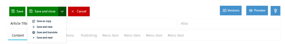
Prototype at the "Edit an Article" Point with the Save&Close combined with a Dropdown.
https://projects.invisionapp.com/share/D7EQEPUF3#/screens/267320993
Hi, this: https://projects.invisionapp.com/share/D7EQEPUF3#/screens/267320993 solves this issue. The question is if this issue should be closed now or should we wait until the changes will be released in some development version.

I'll dive in to this mess by suggesting, instead of just plain "Save" label in the button which we know that it will save and reload. When I train our staff using Joomla after each upgrade, I have to explain to them what Save, Save & Close does. I always have to explain that when Save is clicked, it will save but it won't take you anywhere. So, why not make it simple and direct to that point:
Save & Stay
Why does it have to be sound so cool and technical "Save & Reload" or simply Save which is not intuitive?
I'm in for a separate buttons rather than hiding it in a dropdown, AcyMailing is doing that and it's annoying!
| Status | Discussion | ⇒ | Closed |
| Closed_Date | 0000-00-00 00:00:00 | ⇒ | 2018-05-23 09:09:24 |
| Closed_By | ⇒ | brianteeman | |
| Labels |
Added:
J4 Issue
|
||
I am closing this for now. The J4 template team are coding a solution

I know this is closed but...
- The new buttons (in Joomla! 4.0 dev 6) are much bigger than the old ones, so they're going to look more cluttered, however many there are. Reducing the font size slightly and less padding around the button text would help. (I haven't forked this project yet, but will do later to see if I can find the right code to tweak).
- On a desktop, if you narrow the browser window, the buttons wrap, but there is no gap between the rows. It needs margin-bottom adding to the .subhead .btn-toolbar > * selector and an additional selector to remove the margin-left for the first child on any row other than the first.
- My vote is for the original separate buttons for Save, Save & Close, Save & New, Save as Copy, Close as before. I've never used versions.
@cpfeifer please advice