[#31028] - [4.0] move icon to block
- Fixed in Code Base
- 19 Oct 2020
- Medium
- Build: 4.0-dev
- # 31028
- Diff
- N6REJ:29733
- Pending continuous-integration/drone/pr Build is running Details
- Failure continuous-integration/appveyor/pr AppVeyor was unable to build non-mergeable pull request Details
User tests: Successful: Unsuccessful:
Pull Request for Issue #29733
Summary of Changes
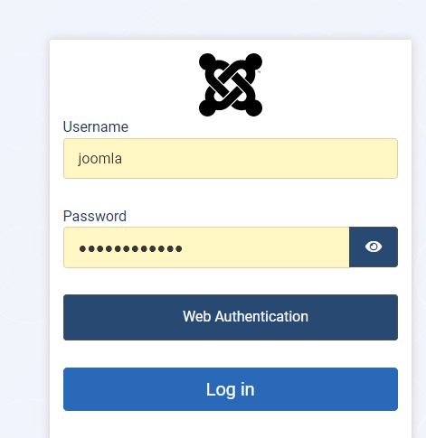
move icon to block for webauth button
Testing Instructions
Access Joomla 4 over a SSL
Go to /administrator/
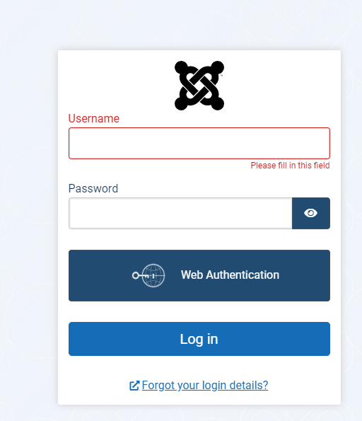
notice that icon is missing
apply pr.
in termal run npm ci
notice that icon is showing in webauth block
notice that the joomla logo is colorized
Actual result BEFORE applying this Pull Request
Expected result AFTER applying this Pull Request

Documentation Changes Required
none
| Status | New | ⇒ | Pending |
 joomla-cms-bot
-
joomla-cms-bot
- | Category | ⇒ | Repository NPM Change |


can definitely be white. Not sure why it's black. I was thinking the same thing to be honest.
as for making it smaller, believe it or not it doesn't play nice. I tried several times to get the block to a more uniform size and was unable to.
I can always go back to the drawing board if desired.
how's this?
| Labels |
Added:
NPM Resource Changed
?
|
||
| Category | Repository NPM Change | ⇒ | Repository NPM Change Front End Plugins |
Much Better but still bad :)
Its not your fault - its just a crappy logo which then pushes the text to "appear" not centered.
Maybe less padding to the left of "Web" maybe? but what do I know :)
This is the best I can do.

@N6REJ Could you fix the SCSS code style errors reported here by Drone? https://ci.joomla.org/joomla/joomla-cms/36296/1/22
They are mainly about ordering of properties. The reason why you didn't notice that might be that drone failed for unrelated reasons at some other test before running the scss cs test.
Now after I have restarted drone it turned out there are these scss code style errors.
Thanks in advance.
This is the best I can do.
Like I said I don't think this is your fault - just a crappy logo... Can we even just remove the logo? after all its never shown to anyone before you fixed it anyway :) haha that would solve all the issues. !?
Like I said I don't think this is your fault - just a crappy logo... Can we even just remove the logo? after all its never shown to anyone before you fixed it anyway :) haha that would solve all the issues. !?
Agree. That logo just shows too many small details for being used as an icon.

Please use SVG for the icon as anything non vector will always be crappy in some scenarios.
Copy paste the icon from here:
https://iconify.design/icon-sets/simple-icons/webauthn.html
License : cc, so it's fine
well, took a while to get everything "perfect" but I think we got there as far as using an icon goes.
as for removing it, you'd need to ask someone far higher up the food chain then me if thats ok.
If the icon is staying, then the great job you have done now gets a thumbs up from me and is a lot better than the first black logo attempt.
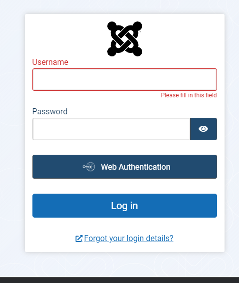
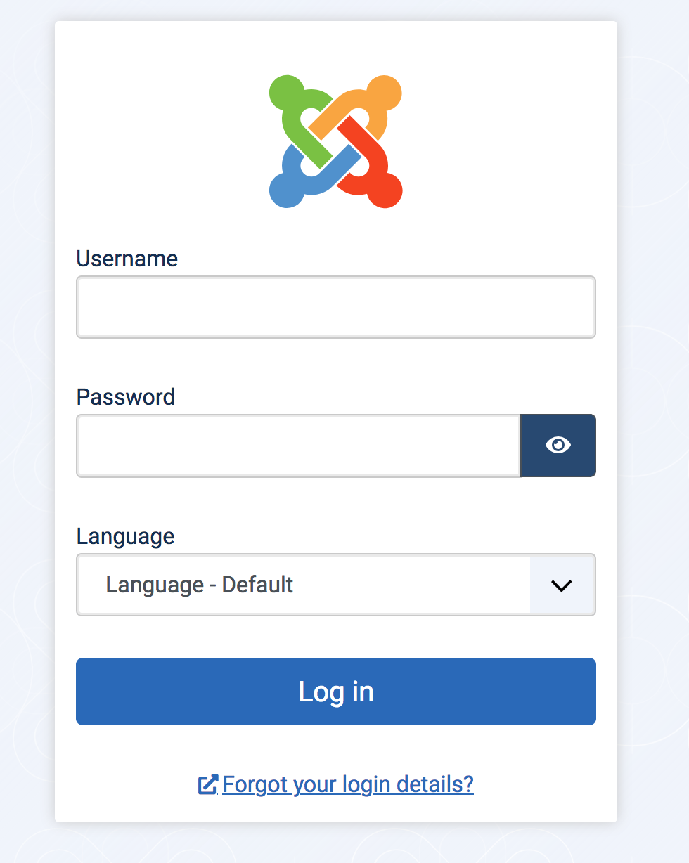
Just another Sunday question - why are we using a black version of the joomla logo instead of the actual colour logo on the login page there? Surely the project should be using and promoting its main symbol on the main login page and not a manipulated black version. Just a thought.

why are we using a black version of the joomla logo instead of the actual colour logo
Good question...
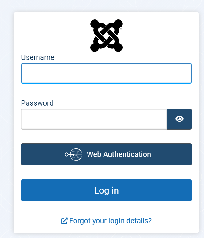
Here is a login page with a colored svg (size can be modified)
| Category | Repository NPM Change Front End Plugins | ⇒ | Administration Templates (admin) Repository NPM Change Front End Plugins |
@PhilETaylor @infograf768 done and ty for supplying the svg file
READY FOR TESTING FINALLY
| Title |
|
||||||

I have tested this item
The result is exactly like the expected one in the description
This comment was created with the J!Tracker Application at issues.joomla.org/tracker/joomla-cms/31028.

Tested logo changes to color
But I don't see the web auth button
@Turikhay144 The WebAuth button can only be seen when accessing the site with https. I assume you used http.

I have tested this item
This comment was created with the J!Tracker Application at issues.joomla.org/tracker/joomla-cms/31028.
| Status | Pending | ⇒ | Ready to Commit |
RTC
This comment was created with the J!Tracker Application at issues.joomla.org/tracker/joomla-cms/31028.
| Status | Ready to Commit | ⇒ | Fixed in Code Base |
| Closed_Date | 0000-00-00 00:00:00 | ⇒ | 2020-10-19 21:05:24 |
| Closed_By | ⇒ | richard67 | |
| Labels |
Added:
?
|
||
Thanks everybody who was involved.
Black on blue?... any chance it can be white? and why double the height of the button? Sorry, don't like it :) :) :)
And No, I could not do better :)